# Devin — B2B Connector Systems Style Reference
> Calm editorial software direction for industrial connector and terminal teams.

**Theme:** light

Devin uses a warm paper field, substantial navy typography, cobalt actions, and coral accents to make technical B2B services feel direct and organized. The journey supports evaluation, a project conversation, and a locally validated RFQ; it does not include retail purchase controls.

## Tokens — Colors

| Name | Value | Token | Role |
|---|---|---|---|
| Paper | `#f8f6f1` | `--canvas` | Main canvas |
| Navy | `#10233f` | `--ink` | Headlines and dark bands |
| Cobalt | `#315ecf` | `--action` | Primary actions and active signals |
| Coral | `#f07f68` | `--coral` | Eyebrows and inquiry surface |
| Mist | `#e8eefb` | `--mist` | Process background |
| Slate | `#5d6880` | `--muted` | Supporting text |
| Rule | `#cfd5df` | `--rule` | Borders and divisions |

## Tokens — Typography

Use `Inter, ui-sans-serif, system-ui, sans-serif`; local system fallbacks keep the build self-contained. Headlines are compact, heavy and tightly tracked; body copy is open and readable.

### Type Scale

| Role | Family | Weight | Size | Line Height | Token |
|---|---|---:|---:|---:|---|
| eyebrow | Inter | 800 | 11px | 1.2 | `--type-eyebrow` |
| body | Inter | 400 | 16px | 1.55 | `--type-body` |
| lead | Inter | 400 | 18px | 1.55 | `--type-lead` |
| card | Inter | 700 | 27px | 1.03 | `--type-card` |
| display | Inter | 800 | 72px | 1.03 | `--type-display` |

## Tokens — Spacing & Shapes

Comfortable spacing, square panels, fine rules, and two circular hero orbits create a disciplined systems aesthetic.

### Spacing Scale

| Name | Value | Token |
|---|---:|---|
| compact | 12px | `--space-compact` |
| control | 16px | `--space-control` |
| card | 24px | `--space-card` |
| section | 112px | `--space-section` |

### Border Radius

| Element | Value | Token |
|---|---:|---|
| cards | 0px | `--radius` |
| controls | 0px | `--radius` |

### Layout

- **Page shell:** `--layout-max` / 1180px with `--gutter` / 32px.
- **Hero:** `--hero-height` / 640px at desktop.
- **Phone:** below 760px, all multi-column grids become one column.

## Components

### Header and Mobile Navigation
The sticky header pairs the brand with Services, Work, Pricing and Contact. Below 760px, a labelled menu button discloses navigation; Escape closes it and returns focus to the trigger.

### Evaluation Hero
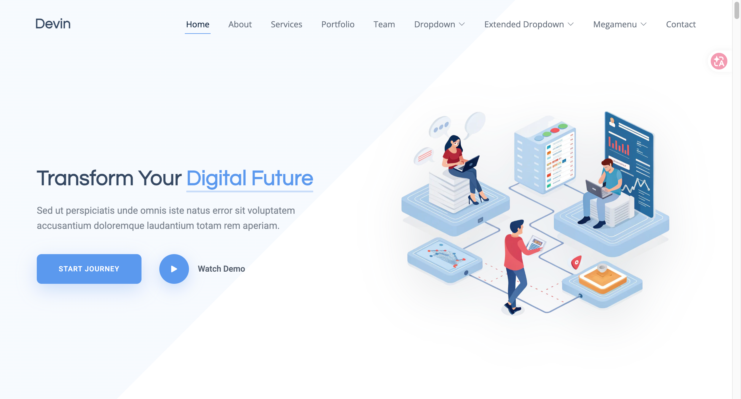
The hero places a clear operating-system message beside a local WebP workflow illustration and circular CSS orbits. Primary action goes to the project inquiry.

### Service Cards
Three numbered, ruled cards describe discovery, product design and connected operations. Cards communicate capability themes without unverified specification claims.

### Case Panels
Two flat panels use cobalt and coral to introduce connector-platform and terminal-experience scenarios, each ending in a discussion link.

### Local Inquiry Form
The form has visible labels, inline required-field messages, a disabled sending state, and a local completion message. It stores and transmits nothing.

## Do's and Don'ts

### Do

- Use cobalt for one primary action at a time.
- Preserve visible keyboard focus and descriptive labels.
- Use navy, paper, coral and mist in large flat editorial bands.
- Keep the path oriented around service evaluation and an RFQ conversation.

### Don't

- Do not add a cart, checkout, payment UI, price promotion or retail product grid.
- Do not use gradients, drop shadows, or rounded-card decoration.
- Do not load remote fonts, analytics, embeds, or form endpoints.
- Do not present fictional metrics or case outcomes as company proof.

## Surfaces

| Level | Name | Value | Purpose |
|---|---|---|---|
| 0 | Paper canvas | `#f8f6f1` | Default page field |
| 1 | Mist process | `#e8eefb` | Structured process section |
| 2 | Navy case | `#10233f` | Work and footer bands |
| 3 | Coral inquiry | `#f07f68` | Contact conversion zone |

## Elevation

- **Service cards:** 1px `--rule` border, no shadow.
- **Buttons:** flat cobalt fill, no elevation.
- **Header:** sticky positioning only; no decorative shadow.

## Imagery

Use the local `assets/devin-hero.webp` workflow illustration as a contained hero visual over CSS orbit rings. Raster assets are WebP and decorative marks are SVG or CSS. Alt text describes the illustration rather than repeating nearby copy.

## Layout

Stack the sticky header, split hero, proof strip, service cards, dark case panels, four-step process, engagement cards, coral inquiry form, and footer. The desktop hero is 1fr/.88fr; services and engagement models use three columns; the process uses four columns; mobile uses one-column reading order.

## Agent Prompt Guide

**Quick Color Reference**

- Background: `#f8f6f1` paper and `#10233f` navy bands.
- Text: `#10233f` on light surfaces and white on navy.
- Border: `#cfd5df` hairline rules.
- Accent: `#315ecf` cobalt action and `#f07f68` coral inquiry.

**Example Component Prompts**

1. **B2B Service Card:** white or paper surface, 1px rule, 24px padding, 27px navy headline, short supporting copy, and an inquiry link.
2. **Primary Inquiry Button:** cobalt `#315ecf`, white 700/14px label, square corners, 13px by 20px padding, arrow suffix.
3. **Process Step Row:** mist background, four ruled columns, 11px cobalt number, 25px navy heading, and concise supporting copy; stack at 760px.

## Similar Brands

- **IDEO** — outcome-oriented consultancy storytelling with editorial hierarchy.
- **Work & Co** — restrained digital-service presentation and portfolio rhythm.
- **Instrument** — systems-focused product direction with strong typography.
- **Base Design** — layout-first studio composition and color blocking.

## Quick Start

Use the standalone implementation block for a local build and the Tailwind block for token registration.

### CSS Custom Properties

```css
:root {
  --canvas: #f8f6f1;
  --surface: #ffffff;
  --ink: #10233f;
  --action: #315ecf;
  --coral: #f07f68;
  --mist: #e8eefb;
  --muted: #5d6880;
  --rule: #cfd5df;
  --font-heading: Inter, ui-sans-serif, system-ui, sans-serif;
  --font-body: Inter, ui-sans-serif, system-ui, sans-serif;
  --type-eyebrow: 11px;
  --type-body: 16px;
  --type-lead: 18px;
  --type-card: 27px;
  --type-display: 72px;
  --space-compact: 12px;
  --space-control: 16px;
  --space-card: 24px;
  --space-section: 112px;
  --layout-max: 1180px;
  --gutter: 32px;
  --radius: 0px;
  --hero-height: 640px;
}
.shell { width: min(var(--layout-max), calc(100% - (var(--gutter) * 2))); margin-inline: auto; }
.button { display: inline-flex; gap: 13px; padding: 13px 20px; background: var(--action); color: var(--surface); font: 700 14px/1 var(--font-body); text-decoration: none; }
.service-card { border: 1px solid var(--rule); padding: 24px; background: var(--surface); }
@media (max-width: 760px) { :root { --gutter: 16px; --hero-height: 480px; } .split-grid, .service-grid, .process-grid { grid-template-columns: 1fr; } }
```

### Tailwind v4

```css
@theme {
  --color-canvas: #f8f6f1;
  --color-surface: #ffffff;
  --color-ink: #10233f;
  --color-action: #315ecf;
  --color-coral: #f07f68;
  --color-mist: #e8eefb;
  --color-muted: #5d6880;
  --color-rule: #cfd5df;
  --font-heading: Inter, ui-sans-serif, system-ui, sans-serif;
  --font-body: Inter, ui-sans-serif, system-ui, sans-serif;
  --spacing-layout-max: 1180px;
  --spacing-gutter: 32px;
  --radius-system: 0px;
  --spacing-hero-height: 640px;
}
```