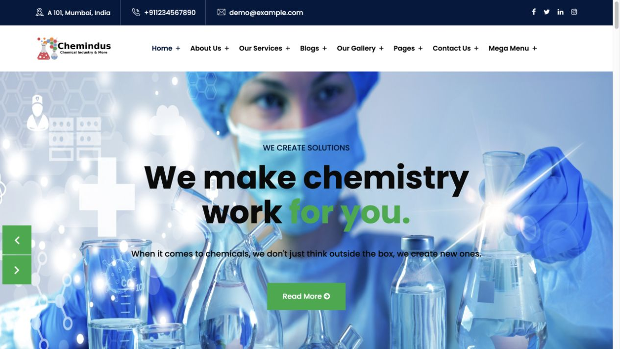
# Chemindus — Style Reference
> Centered chemical-services portal: clinical white, deep-blue utility bands, and a precise green action signal.

**Theme:** light

This is an original B2B implementation specification informed by the Chemindus visual direction. It uses an invented brand and generic copy. Keep the large centered process visual, square controls, white navigation, and broad content rhythm; do not reuse source branding, photography, credentials, years-in-business language, or customer statements. The intended journey is browse services → assess an application → request a quote. It contains no cart, payment, or checkout treatment.

## Tokens — Colors

| Name | Value | Token | Role |
|---|---|---|---|
| White Canvas | `#ffffff` | `--color-canvas` | Main canvas, navigation and control fill |
| Heading Ink | `#0a0a0a` | `--color-ink` | Headlines and strong text on light surfaces |
| Body Graphite | `#454545` | `--color-body` | Paragraphs and supporting copy |
| Process Green | `#0caa41` | `--color-action` | Primary action, card rule and highlighted hero word |
| Process Green Dark | `#087a30` | `--color-action-hover` | Hover fill and readable green text on white |
| Action Ink | `#062d17` | `--color-action-ink` | Button text on Process Green |
| Utility Blue | `#01193d` | `--color-utility` | Contact strip, RFQ surface and footer |
| Utility Blue Hover | `#06306b` | `--color-utility-hover` | Hover fill for deep-blue controls |
| Soft Field | `#f1f1f1` | `--color-surface-soft` | Application and visual-panel background |
| Control Border | `#a9b4ad` | `--color-border` | Inputs and visible control boundaries |
| Fine Border | `#d9dfdb` | `--color-border-subtle` | Card and navigation dividers |
| Light Focus | `#075e2a` | `--color-focus-light` | Focus ring on light surfaces |
| Dark Focus | `#a7f3c1` | `--color-focus-dark` | Focus ring on dark surfaces |
| Error Red | `#b42318` | `--color-error` | Invalid control border and error state |
| Error on Dark | `#ffb4ab` | `--color-error-on-dark` | Inline error text on the RFQ surface |
| Border on Dark | `#304563` | `--color-border-on-dark` | Footer divider on deep-blue surfaces |

Process Green always carries Action Ink, not white, in the default button. Its hover state changes to dark green with white text. This keeps the action treatment legible while retaining the source-inspired green signal.

## Tokens — Typography

Poppins is the single family for display, body, and interface. Load only 400, 500, 600, and 700. The complete stylesheet imports these Google Fonts weights; a production project may replace that import with an approved self-hosted source while retaining the family, weights, and fallbacks.

### Type Scale

| Role | Family | Weight | Size | Line Height | Letter Spacing | Token |
|---|---|---:|---:|---:|---:|---|
| caption | Poppins | 400 | 12px | 1.4 | normal | `--text-caption` |
| label | Poppins | 600 | 14px | 1.35 | normal | `--text-label` |
| body | Poppins | 400 | 15px | 1.7 | normal | `--text-body` |
| lead | Poppins | 400 | 18px | 1.55 | normal | `--text-lead` |
| card heading | Poppins | 600 | 20px | 1.35 | normal | `--text-card` |
| section heading | Poppins | 600 | 36px | 1.25 | -0.02em | `--text-section` |
| hero | Poppins | 700 | 65px | 1.1 | -0.04em | `--text-hero` |

On phones, hero headings become 36px and section headings become 30px. Do not synthesize font weights or use condensed display substitutes.

## Tokens — Spacing & Shapes

**Density:** spacious editorial sections with compact utility and navigation rows. Square corners and flat borders establish a measured industrial character.

### Spacing Scale

| Name | Value | Token |
|---|---:|---|
| 1 | 8px | `--space-1` |
| 2 | 12px | `--space-2` |
| 3 | 16px | `--space-3` |
| 4 | 24px | `--space-4` |
| 5 | 32px | `--space-5` |
| 6 | 48px | `--space-6` |
| 7 | 60px | `--space-7` |
| section | 100px | `--space-section` |

### Border Radius

| Element | Value | Token |
|---|---:|---|
| cards | 0px | `--radius-card` |
| buttons | 0px | `--radius-control` |
| inputs | 0px | `--radius-control` |
| navigation | 0px | `--radius-control` |

### Layout

- Desktop content width: `--layout-max` / 1140px; page gutters: `--layout-gutter` / 24px.
- Hero field: centered and full-width with `--hero-min-height` / 570px, not a split product layout.
- Section rhythm: 100px vertical padding; phone sections use 60px and 16px gutters.

## Components

### Utility Bar
`.utility-bar` is a 50px deep-blue contact strip. `.utility-bar .shell` uses a simple left-aligned row. Keep text concise; do not fill it with claims, badges, or social counters.

### Header and Mobile Navigation
`.site-header` and `.nav-row` create the white 96px desktop navigation. `.brand` is text-only and invented; `.nav-list` holds anchor links. On screens up to 760px, `.nav-toggle` controls `.nav-list[data-open='true']`. Opening moves focus to the first link; closing with the toggle, an anchor link, or Escape returns focus to the toggle. The collapsed list has no hidden keyboard targets.

### Hero
`.hero`, `.hero-content`, `.eyebrow`, `.hero-copy`, and `.button` make the first screen a centered process statement over the original `assets/chemical-process.svg`. Highlight one short word with `h1 em`; use one primary RFQ action only. The SVG is a generic visual, not process instruction or a real facility depiction.

### Overview
`.overview` pairs explanatory copy with `.overview-visual`, a flat soft-gray original SVG panel. It becomes one column on phone. Use it to introduce capability categories without performance, certification, or manufacturing claims.

### Services
`.service-grid` contains three `.service-card` items. Cards have a 4px green top rule, a hairline border, 32px padding, and no shadow or rounding. Each card links to a broader service or application area, never to a purchasable SKU.

### Application and FAQ
`.application` contains `.application-grid` and `.application-item` for three scannable consideration areas. `.faq-list` uses native `.faq-item` disclosure controls with visible summary focus. Keep answers informational and avoid laboratory operating instructions.

### RFQ Form
`.rfq` is a deep-blue request band with `.rfq-grid` and `.rfq-form`. Require either `name` or `company` through group validation, plus `email` and `application/message`; mark each required control in its label. On validation failure, set `aria-invalid="true"`, connect `.field-error` by `aria-describedby`, announce the summary through `.form-status[role="status"]`, and focus the first invalid field. On submit, disable the submit `.button`, set `aria-busy="true"` for 500ms locally, then restore it and state clearly: “Request prepared locally; nothing was sent. Your entries remain available to edit.” No network request, localStorage, payment, price, or real quote is involved.

### Footer
`.site-footer`, `.footer-grid`, and `.footer-base` provide deep-blue navigation, a generic contact route, and copyright placeholder. Do not use source logos, addresses, social profiles, customer logos, or achievement counters.

## Do's and Don'ts

### Do

- Use the 1140px centered shell with generous 100px desktop section padding.
- Keep the hero visual centered and full width, with a single green RFQ action.
- Use flat, square cards with green top rules and fine borders.
- Use Action Ink on green buttons and the declared focus colors on their matching surfaces.
- Keep service discovery and quote preparation as the primary B2B path.
- Preserve native disclosure semantics and clear local-only form feedback.

### Don't

- Don't turn the hero into a left/right product-commerce split.
- Don't add a bag, cart, price, payment, checkout, or account-purchase flow.
- Don't reuse source photography, logos, people, certifications, client logos, or business-history claims.
- Don't use rounded SaaS cards, pills, gradients, or floating shadows.
- Don't put white body-sized text on the bright green default button.
- Don't imply that the form transmits data or produces a live quotation.

## Surfaces

| Level | Name | Value | Purpose |
|---:|---|---|---|
| 0 | White Canvas | `#ffffff` | Page, header, service-card, and control background |
| 1 | Soft Field | `#f1f1f1` | Overview visual and application section |
| 2 | Utility Blue | `#01193d` | Utility strip and RFQ interaction surface |
| 3 | Footer Blue | `#01193d` | Footer navigation and legal base |

## Elevation

- Service cards: `none`; use `1px solid var(--color-border-subtle)` and a green top rule.
- Buttons: `none`; use fill, border, hover color, disabled opacity, and a visible focus outline.
- Mobile navigation: `none`; it is an in-flow white panel with a divider, not a floating drawer.

## Imagery

Use `assets/chemical-process.svg` as the only supplied visual: it is an original abstract glassware-and-process illustration with no people, company marks, safety seals, or operating steps. Use full-width, cool neutral fields and precise green accents; keep crop treatment square and quiet. If photography is introduced later, it must be licensed project media and should depict general industrial context without copying source compositions.

## Layout

Desktop follows utility bar → white header → centered full-width hero → overview → three service cards → application → FAQ → RFQ → footer. The `.shell` is 1140px at wide widths. At 760px and below, hide the utility bar, collapse navigation, make overview/RFQ/footer single-column, and stack service and application cards. Anchor navigation closes the open mobile list after it moves to the target.

## Agent Prompt Guide

**Quick Color Reference**

- Canvas: `#ffffff`; heading: `#0a0a0a`; body: `#454545`.
- Action: `#0caa41` with `#062d17` text; hover: `#087a30` with white text.
- Deep surfaces: `#01193d` with white copy and `#a7f3c1` focus ring.
- Borders: `#a9b4ad` for controls and `#d9dfdb` for structural dividers.

**Example Component Prompts**

1. **Centered process hero:** Create `.hero` at 570px minimum height using the original chemical-process SVG as a muted background. Center a 65px Poppins 700 headline, accent one word in `#0caa41`, and add one square 56px RFQ button with dark-green text.
2. **Service card trio:** Create `.service-grid` with three equal `.service-card` columns at 1140px. Give each card a 4px `#0caa41` top rule, 1px `#d9dfdb` border, 32px padding, no radius, and no shadow; stack on phones.
3. **Local-only RFQ:** Create `.rfq-form` with name-or-company, email, and application/message requirements. Provide inline `aria-describedby` errors, first-error focus, 500ms disabled busy feedback, and an explicit message that nothing was sent and entries remain editable.

## Similar Brands

- **BASF** — Corporate chemical communications often pair deep blue with concise capability navigation.
- **Brenntag** — B2B chemical distribution uses application-led discovery and clear inquiry paths.
- **Dow** — Large process-industry sites demonstrate the value of spacious technical storytelling and restrained action color.
- **Ecolab** — Service-oriented industrial pages balance white space, green cues, and request-oriented calls to action.

## Quick Start

### CSS Custom Properties

Use this complete stylesheet as the blank-project starting point. It includes the tokens, layout, every named component, responsive behavior, keyboard focus, disabled and error states, local busy feedback, and reduced-motion handling. The leading Google Fonts import loads only Poppins 400, 500, 600, and 700; replace it with an approved self-hosted source when required. This CSS has no vendor dependency.

```css
@import url('https://fonts.googleapis.com/css2?family=Poppins:wght@400;500;600;700&display=swap');

:root {
  --color-canvas: #ffffff;
  --color-ink: #0a0a0a;
  --color-body: #454545;
  --color-action: #0caa41;
  --color-action-hover: #087a30;
  --color-action-ink: #062d17;
  --color-utility: #01193d;
  --color-utility-hover: #06306b;
  --color-footer: #01193d;
  --color-surface-soft: #f1f1f1;
  --color-border: #a9b4ad;
  --color-border-subtle: #d9dfdb;
  --color-focus-light: #075e2a;
  --color-focus-dark: #a7f3c1;
  --color-error: #b42318;
  --color-error-bg: #fff2f0;
  --color-error-on-dark: #ffb4ab;
  --color-border-on-dark: #304563;
  --color-on-dark: #ffffff;
  --font-heading: 'Poppins', Arial, sans-serif;
  --font-body: 'Poppins', Arial, sans-serif;
  --text-caption: 12px;
  --text-label: 14px;
  --text-body: 15px;
  --text-lead: 18px;
  --text-card: 20px;
  --text-section: 36px;
  --text-hero: 65px;
  --space-1: 8px;
  --space-2: 12px;
  --space-3: 16px;
  --space-4: 24px;
  --space-5: 32px;
  --space-6: 48px;
  --space-7: 60px;
  --space-section: 100px;
  --layout-max: 1140px;
  --layout-gutter: 24px;
  --hero-min-height: 570px;
  --radius-card: 0px;
  --radius-control: 0px;
  --shadow-none: none;
}

* { box-sizing: border-box; }
html { scroll-behavior: smooth; }
body { margin: 0; background: var(--color-canvas); color: var(--color-body); font-family: var(--font-body); font-size: var(--text-body); font-weight: 400; line-height: 1.7; }
img, svg { display: block; max-width: 100%; }
a { color: inherit; }
button, input, textarea { font: inherit; }
.skip-link { position: fixed; z-index: 20; top: 8px; left: 8px; transform: translateY(-160%); padding: var(--space-2) var(--space-3); background: var(--color-canvas); color: var(--color-utility); }
.skip-link:focus { transform: translateY(0); }
.shell { width: min(100% - (2 * var(--layout-gutter)), var(--layout-max)); margin-inline: auto; }
.utility-bar { background: var(--color-utility); color: var(--color-on-dark); font-size: var(--text-label); }
.utility-bar .shell { display: flex; min-height: 50px; align-items: center; gap: var(--space-4); }
.site-header { background: var(--color-canvas); border-bottom: 1px solid var(--color-border-subtle); }
.nav-row { display: flex; min-height: 96px; align-items: center; justify-content: space-between; gap: var(--space-4); }
.brand { color: var(--color-utility); font-size: 20px; font-weight: 700; line-height: 1.1; text-decoration: none; }
.brand small { display: block; color: var(--color-action-hover); font-size: var(--text-caption); font-weight: 500; }
.nav-list { display: flex; align-items: center; gap: 28px; margin: 0; padding: 0; list-style: none; }
.nav-list a, .nav-toggle { color: var(--color-ink); font-size: var(--text-label); font-weight: 600; text-decoration: none; }
.nav-toggle { display: none; border: 1px solid var(--color-utility); background: var(--color-canvas); padding: 10px 14px; }
.hero { position: relative; display: grid; place-items: center; min-height: var(--hero-min-height); overflow: hidden; background: linear-gradient(115deg, rgba(255,255,255,.91), rgba(255,255,255,.64)), url('assets/chemical-process.svg') center / cover; text-align: center; }
.hero-content { max-width: 950px; padding-block: var(--space-7); }
.eyebrow { margin: 0 0 var(--space-2); color: var(--color-action-hover); font-size: var(--text-label); font-weight: 600; letter-spacing: .08em; text-transform: uppercase; }
h1, h2, h3 { margin: 0; color: var(--color-ink); font-family: var(--font-heading); }
h1 { font-size: var(--text-hero); font-weight: 700; letter-spacing: -.04em; line-height: 1.1; }
h1 em { color: var(--color-action); font-style: normal; }
h2 { font-size: var(--text-section); font-weight: 600; line-height: 1.25; }
h3 { font-size: var(--text-card); font-weight: 600; line-height: 1.35; }
.hero-copy { max-width: 720px; margin: var(--space-4) auto var(--space-5); color: var(--color-ink); font-size: var(--text-lead); }
.button { display: inline-flex; min-height: 56px; align-items: center; justify-content: center; border: 1px solid transparent; border-radius: var(--radius-control); padding: 14px 32px; background: var(--color-action); color: var(--color-action-ink); font-size: var(--text-body); font-weight: 600; text-decoration: none; }
.button:hover { background: var(--color-action-hover); color: var(--color-on-dark); }
.button--dark { background: var(--color-utility); color: var(--color-on-dark); }
.button--dark:hover { background: var(--color-utility-hover); }
.section { padding-block: var(--space-section); }
.section-heading { display: grid; gap: var(--space-3); max-width: 640px; margin-bottom: var(--space-6); }
.section-heading p { margin: 0; }
.overview { display: grid; grid-template-columns: 1fr 1.1fr; gap: var(--space-7); align-items: center; }
.overview-visual { min-height: 340px; background: var(--color-surface-soft) url('assets/chemical-process.svg') center / 82% no-repeat; border: 1px solid var(--color-border-subtle); }
.service-grid { display: grid; grid-template-columns: repeat(3, 1fr); gap: var(--space-4); }
.service-card { min-height: 250px; border: 1px solid var(--color-border-subtle); border-top: 4px solid var(--color-action); padding: var(--space-5); background: var(--color-canvas); box-shadow: var(--shadow-none); }
.service-card p { margin: var(--space-2) 0 0; }
.application { background: var(--color-surface-soft); }
.application-grid { display: grid; grid-template-columns: repeat(3, 1fr); gap: var(--space-3); }
.application-item { padding: var(--space-4); border-left: 3px solid var(--color-action); background: var(--color-canvas); }
.faq-list { display: grid; gap: var(--space-2); }
.faq-item { border: 1px solid var(--color-border-subtle); }
.faq-item summary { cursor: pointer; padding: var(--space-3) var(--space-4); color: var(--color-ink); font-weight: 600; }
.faq-item p { margin: 0; padding: 0 var(--space-4) var(--space-4); }
.rfq { background: var(--color-utility); color: var(--color-on-dark); }
.rfq h2, .rfq h3 { color: var(--color-on-dark); }
.rfq-grid { display: grid; grid-template-columns: .85fr 1.15fr; gap: var(--space-7); align-items: start; }
.rfq-form { display: grid; gap: var(--space-3); }
.field { display: grid; gap: var(--space-1); }
.field label { font-size: var(--text-label); font-weight: 600; }
.field input, .field textarea { width: 100%; border: 1px solid var(--color-border); border-radius: var(--radius-control); padding: 14px 16px; background: var(--color-canvas); color: var(--color-ink); }
.field textarea { min-height: 132px; resize: vertical; }
.field [aria-invalid='true'] { border-color: var(--color-error); background: var(--color-error-bg); }
.field-error { min-height: 1.4em; color: var(--color-error-on-dark); font-size: var(--text-caption); }
.form-status { min-height: 1.7em; margin: 0; color: var(--color-on-dark); }
.button[disabled] { cursor: not-allowed; opacity: .62; }
.button[aria-busy='true'] { cursor: wait; }
.site-footer { padding-top: var(--space-7); background: var(--color-footer); color: var(--color-on-dark); }
.footer-grid { display: grid; grid-template-columns: 1.3fr repeat(2, 1fr); gap: var(--space-6); padding-bottom: var(--space-6); }
.site-footer h3 { color: var(--color-on-dark); font-size: var(--text-label); }
.site-footer a { color: var(--color-on-dark); }
.footer-base { border-top: 1px solid var(--color-border-on-dark); padding-block: var(--space-3); font-size: var(--text-caption); }
:where(a, button, input, textarea, summary):focus-visible { outline: 3px solid var(--color-focus-light); outline-offset: 3px; }
.utility-bar :where(a, button):focus-visible, .rfq :where(a, button, input, textarea):focus-visible, .site-footer a:focus-visible { outline-color: var(--color-focus-dark); }
@media (max-width: 760px) {
  :root { --layout-gutter: 16px; --hero-min-height: 480px; --text-hero: 36px; --text-section: 30px; --space-section: 60px; }
  .utility-bar { display: none; }
  .nav-row { min-height: 74px; }
  .nav-toggle { display: inline-flex; }
  .nav-list { position: absolute; z-index: 10; top: 74px; right: 0; left: 0; display: none; flex-direction: column; align-items: stretch; gap: 0; padding: var(--space-3) var(--layout-gutter); background: var(--color-canvas); border-bottom: 1px solid var(--color-border-subtle); }
  .nav-list[data-open='true'] { display: flex; }
  .nav-list a { padding: var(--space-2) 0; }
  .hero-copy { font-size: var(--text-body); }
  .overview, .rfq-grid, .footer-grid { grid-template-columns: 1fr; gap: var(--space-5); }
  .service-grid, .application-grid { grid-template-columns: 1fr; }
  .service-card { min-height: 0; }
}
@media (prefers-reduced-motion: reduce) { html { scroll-behavior: auto; } *, *::before, *::after { animation-duration: .01ms !important; animation-iteration-count: 1 !important; transition-duration: .01ms !important; } }
```

### Tailwind v4

Optional Tailwind v4 compiler input. It declares direct theme values and is separate from the complete stylesheet above; keep the complete stylesheet for the component rules.

```css
@import "tailwindcss";
@theme {
  --color-canvas: #ffffff;
  --color-ink: #0a0a0a;
  --color-body: #454545;
  --color-action: #0caa41;
  --color-action-hover: #087a30;
  --color-utility: #01193d;
  --color-utility-hover: #06306b;
  --color-soft: #f1f1f1;
  --color-control-border: #a9b4ad;
  --color-error: #b42318;
  --color-error-on-dark: #ffb4ab;
  --font-heading: 'Poppins', Arial, sans-serif;
  --font-body: 'Poppins', Arial, sans-serif;
  --radius-card: 0px;
  --spacing-section: 100px;
}
```