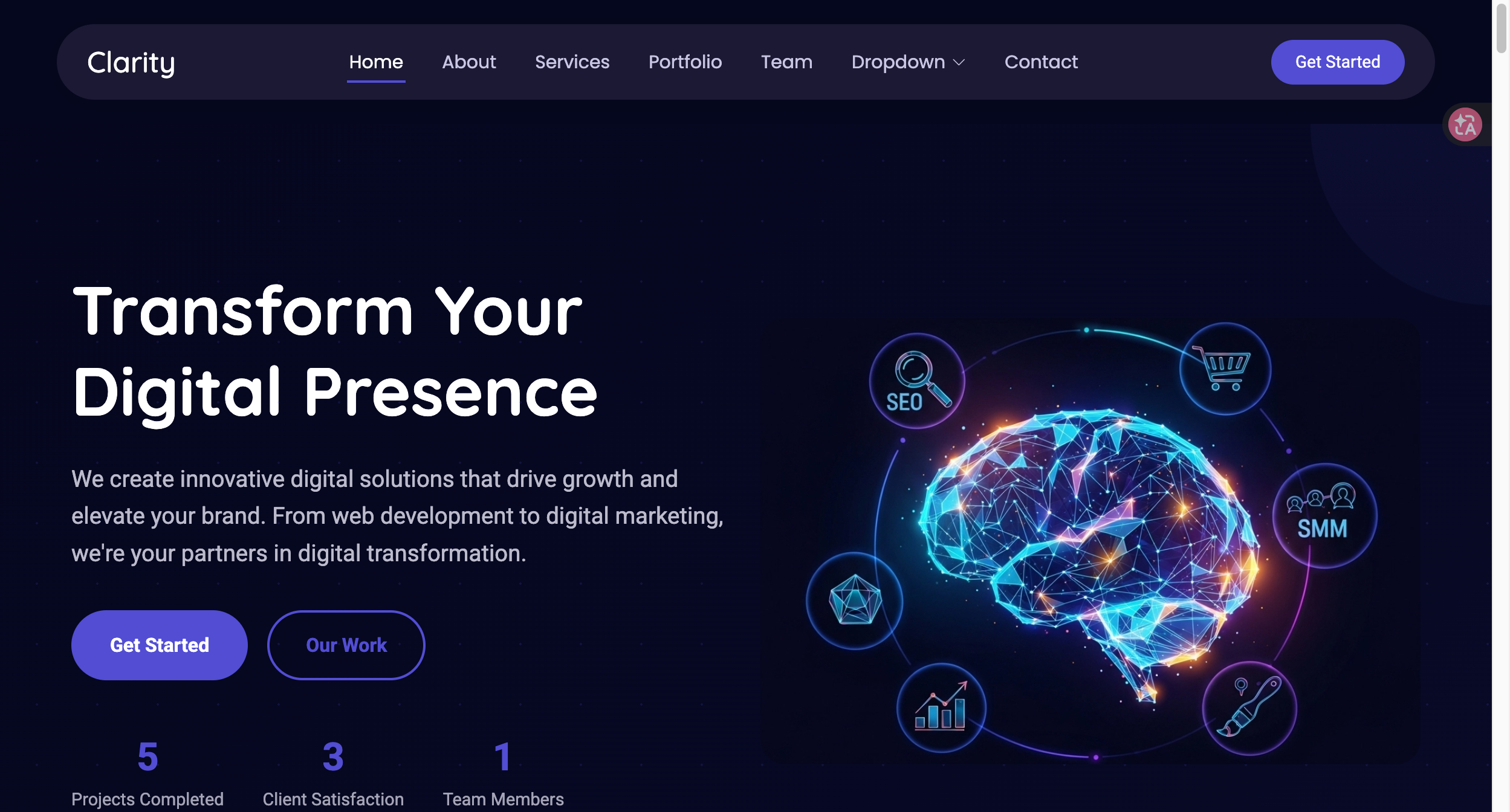
# Clarity — Style Reference
> Centered electronics capability portal: violet signal, dark-gradient hero, and rounded technical surfaces.

**Theme:** light

The visual source is natively a creative-agency services template whose client-inquiry path supports a B2B classification; development boards, electronic modules, and kits are a high-effort adaptation rather than the source industry's subject. This original implementation uses an invented name, abstract CSS geometry, and generic copy to translate the deep-violet, airy direction into a supplier-discovery journey: explore capability → confirm requirements → prepare an inquiry. It does not reproduce third-party code, identity, imagery, customer content, or commercial flows.

## Tokens — Colors

| Name | Value | Token | Role |
|---|---|---|---|
| Canvas | `#ffffff` | `--color-canvas` | Primary page surface |
| Soft Violet Field | `#f7f7ff` | `--color-surface` | Hero and process surface |
| Signal Violet | `#524dd3` | `--color-violet` | Primary action and technical signal |
| Dark Violet | `#39349b` | `--color-violet-dark` | Hover and emphasis |
| Pale Violet | `#e9e8ff` | `--color-violet-pale` | Decorative geometry |
| Light Violet | `#c3c1ff` | `--color-violet-light` | Legible violet accent on dark surfaces |
| Ink | `#202035` | `--color-ink` | Headings and dark inquiry surface |
| Muted | `#62627a` | `--color-muted` | Body text |
| Divider | `#dcdced` | `--color-line` | Card and navigation boundary |

## Tokens — Typography

Quicksand provides rounded, technically approachable display text; Roboto provides compact, familiar operational text; Poppins handles compact navigation. Use only the declared weights and replace hosted fonts with approved files where necessary.

### Type Scale

| Role | Family | Weight | Size | Line Height | Letter Spacing | Token |
|---|---|---:|---:|---:|---:|---|
| caption | Roboto | 400 | 12px | 1.4 | normal | `--text-caption` |
| label | Roboto | 700 | 14px | 1.35 | normal | `--text-label` |
| body | Roboto | 400 | 16px | 1.65 | normal | `--text-body` |
| lead | Roboto | 400 | 19px | 1.6 | normal | `--text-lead` |
| card heading | Quicksand | 700 | 20px | 1.25 | -0.02em | `--text-card` |
| section heading | Quicksand | 700 | 38px | 1.15 | -0.045em | `--text-section` |
| hero | Quicksand | 700 | 60px | 1.08 | -0.055em | `--text-hero` |
| navigation | Poppins | 600 | 14px | 1.35 | normal | `--text-nav` |

## Tokens — Spacing & Shapes

The layout is spacious, with compact navigation and broad section rhythm. Soft 18px cards are reserved for capability groups; controls stay tighter at 8px.

### Spacing Scale

| Name | Value | Token |
|---|---:|---|
| 1 | 8px | `--space-1` |
| 2 | 12px | `--space-2` |
| 3 | 16px | `--space-3` |
| 4 | 24px | `--space-4` |
| 5 | 32px | `--space-5` |
| 6 | 48px | `--space-6` |
| section | 96px | `--space-section` |

### Border Radius

| Element | Value | Token |
|---|---:|---|
| capability card | 18px | `--radius-card` |
| button | 8px | `--radius-control` |
| input | 8px | `--radius-control` |

### Layout

- **Page shell:** centered `--layout-max` / 1160px reading measure with 24px desktop gutters.
- **Hero:** `--hero-min-height` / 580px, 120px vertical breathing room, a dark gradient, and symmetrical original radial geometry.
- **Phone:** at 760px and below, the shell has 16px gutters and all multicolumn groups become one column.

## Components

### Header and Mobile Navigation
`.site-header`, `.nav-row`, and `.nav-list` create a restrained sticky navigation. The inner row is a 50px dark rounded shell with 25px horizontal padding. At the phone breakpoint `.nav-toggle` controls `data-open`; Escape, a second toggle, and a selected link close the list.

### Centered Hero
`.hero` is a centered white statement over an original dark gradient, CSS circles, and radial fields. `.eyebrow`, `h1 em`, and one violet 50px-rounded `.button` communicate a focused capability invitation without a product price or purchase action.

### Capability Cards
`.capability-grid` holds three `.capability-card` panels. Each has a violet ring made with CSS, short category copy, and no stock count, SKU, or cart control.

### Requirements Process
`.process-grid` and `.process-item` present three numbered inquiry-preparation stages. They describe information organization, not testing, compliance, or performance claims.

### Local Inquiry Form
`.form` requires either contact name or organization, plus email and a requirements note. Failed validation sets `aria-invalid`, shows linked errors, and focuses the first problem. A valid submission is busy for 500ms and then says the request was prepared locally and was not sent; it creates no network request, storage, order, or quote. The production handoff should visibly request interface, chip or controller, dimensions, documentation, compliance needs, MOQ, lead time, and OEM/ODM requirements as project-specific fields—not as prefilled claims.

### Footer
`.site-footer` presents generic navigation and contact placeholders. Do not place supplier logos, source marks, social profiles, client names, or outcome metrics here.

## Do's and Don'ts

### Do

- Use violet only as the focused signal for navigation, actions, numbering, and technical geometry.
- Keep the discovery path centered on categories, integration requirements, and a local inquiry handoff.
- Pair every capability label with approved, project-specific facts before implementation.
- Preserve visible keyboard focus, native labels, error text, and a reduced-motion path.

### Don't

- Do not add cart, bag, price, payment, checkout, or account-purchase behavior because a decorative icon appears in a reference.
- Do not reuse template wording, logos, people, portfolio images, or third-party component code.
- Do not represent sample cards as inventory, certification, delivery, compatibility, or performance evidence.
- Do not make the local form imply transmission, a saved lead, or a live quotation.

## Surfaces

| Level | Name | Value | Purpose |
|---:|---|---|---|
| 0 | Canvas | `#ffffff` | Header, cards, fields |
| 1 | Soft Violet Field | `#f7f7ff` | Hero and process section |
| 2 | Ink Inquiry | `#202035` | Requirements callout |
| 3 | Footer Ink | `#151521` | Footer content |

## Elevation

- Capability cards use `--shadow-card` with a thin divider; no floating navigation drawer is required.
- Buttons use fill contrast and a one-pixel border, not depth as an affordance.
- Process cards remain flat so their violet top rule and sequence number lead the scan path.

## Imagery

The visual system uses original CSS gradients, rings, and circles only. Later imagery must be licensed project material showing actual approved modules or boards, with alternative text that identifies the actual product context. Do not reuse reference photography, screenshots, icons, or brand marks.

## Layout

Desktop order is header → centered hero → capability cards → requirements process → local inquiry → footer. The hero remains one centered composition. On narrow screens, navigation becomes a disclosed list and the card, process, inquiry, and footer grids stack without hiding primary content.

## Agent Prompt Guide

**Quick Color Reference**

- Canvas `#ffffff`, ink `#202035`, body `#62627a`, divider `#dcdced`.
- Signal violet `#524dd3`; hover violet `#39349b`; pale geometry `#e9e8ff`.
- Use white text and Light Violet `#c3c1ff` accents on dark surfaces; use `#242078` focus rings on light surfaces and `#c3c1ff` focus rings on dark surfaces.

**Example Component Prompts**

1. **Centered capability hero:** Create a 580px minimum-height `.hero` with original violet radial geometry, a centered 60px Quicksand headline, one short violet emphasis, and one inquiry button.
2. **Technical capability trio:** Create three 18px-radius `.capability-card` panels in a responsive grid. Use CSS-generated violet rings, concise category labels, and no commerce controls.
3. **Local requirements form:** Implement name-or-organization, email, and requirements validation with linked errors, first-error focus, a 500ms busy state, and explicit local-only completion feedback.

## Similar Brands

- **Arduino** — Product ecosystems demonstrate the value of clear board-family orientation without copying its identity.
- **Adafruit** — Education-oriented hardware pages show how categories can be approachable while still precise.
- **SparkFun** — Component discovery can pair technical language with concise next steps.
- **STMicroelectronics** — Enterprise technical communications show the need for verified product facts and support pathways.

## Quick Start

### CSS Custom Properties

Use this complete stylesheet as the blank-project starting point. It contains tokens, responsive layouts, named components, focus states, validation states, local-only busy feedback, and reduced-motion handling. It uses no source code or source assets.

```css
:root {
  --color-canvas: #ffffff; --color-surface: #f7f7ff; --color-ink: #202035; --color-muted: #62627a;
  --color-violet: #524dd3; --color-violet-dark: #39349b; --color-violet-pale: #e9e8ff; --color-violet-light: #c3c1ff;
  --color-line: #dcdced; --color-focus: #242078; --color-focus-dark: #c3c1ff; --color-on-dark: #ffffff; --color-error: #b42318;
  --font-heading: 'Quicksand', Arial, sans-serif; --font-body: 'Roboto', Arial, sans-serif; --font-nav: 'Poppins', Arial, sans-serif;
  --text-caption: 12px; --text-label: 14px; --text-nav: 14px; --text-body: 16px; --text-lead: 19px; --text-card: 20px; --text-section: 38px; --text-hero: 60px;
  --space-1: 8px; --space-2: 12px; --space-3: 16px; --space-4: 24px; --space-5: 32px; --space-6: 48px; --space-section: 96px;
  --layout-max: 1160px; --layout-gutter: 24px; --hero-min-height: 580px; --radius-card: 18px; --radius-control: 8px; --shadow-card: 0 18px 48px rgba(39, 35, 117, .11);
}
* { box-sizing: border-box; } html { scroll-behavior: smooth; } body { margin: 0; color: var(--color-muted); background: var(--color-canvas); font: 400 var(--text-body)/1.65 var(--font-body); }
a { color: inherit; } button, input, textarea { font: inherit; } .shell { width: min(calc(100% - 2 * var(--layout-gutter)), var(--layout-max)); margin-inline: auto; }
.skip-link { position: fixed; top: 8px; left: 8px; z-index: 30; padding: var(--space-2); background: var(--color-violet); color: var(--color-on-dark); transform: translateY(-200%); } .skip-link:focus { transform: translateY(0); }
.site-header { position: sticky; top: 0; z-index: 20; padding-block: 10px; background: color-mix(in srgb, var(--color-canvas) 94%, transparent); backdrop-filter: blur(10px); } .nav-row { min-height: 64px; display: flex; justify-content: space-between; align-items: center; gap: var(--space-4); padding-inline: 25px; border-radius: 50px; background: #1b1933; }
.brand { color: var(--color-on-dark); font: 700 24px/1 var(--font-heading); text-decoration: none; letter-spacing: -.04em; } .brand span { color: #a9a6ff; } .nav-list { display: flex; align-items: center; gap: 28px; list-style: none; padding: 0; margin: 0; } .nav-list a { color: #c8c6e3; font-family: var(--font-nav); font-size: var(--text-nav); font-weight: 600; text-decoration: none; } .nav-list a:hover { color: #ffffff; }
.nav-toggle { display: none; border: 1px solid #aaa7e9; border-radius: 50px; padding: 9px 12px; color: var(--color-on-dark); background: transparent; font-weight: 700; }
.hero { position: relative; overflow: hidden; display: grid; place-items: center; min-height: var(--hero-min-height); text-align: center; background: radial-gradient(circle at 13% 18%, rgba(82,77,211,.75), transparent 33%), radial-gradient(circle at 90% 78%, #1f2240, transparent 34%), linear-gradient(135deg, #05071e, #131428); }
.hero::before, .hero::after { content: ''; position: absolute; width: 300px; aspect-ratio: 1; border: 1px solid rgba(206,204,255,.36); border-radius: 50%; } .hero::before { top: -150px; left: -80px; } .hero::after { right: -110px; bottom: -180px; }
.hero-content { position: relative; z-index: 1; max-width: 820px; padding-block: 120px; } .eyebrow { margin: 0 0 var(--space-3); color: var(--color-violet); font-size: var(--text-label); font-weight: 700; letter-spacing: .11em; text-transform: uppercase; } .hero .eyebrow, .inquiry .eyebrow { color: var(--color-violet-light); } h1,h2,h3 { margin: 0; color: var(--color-ink); font-family: var(--font-heading); } h1 { color: var(--color-on-dark); font-size: var(--text-hero); line-height: 1.12; letter-spacing: -.055em; } h1 em { color: var(--color-violet-light); font-style: normal; } h2 { font-size: var(--text-section); line-height: 1.15; letter-spacing: -.045em; } h3 { font-size: var(--text-card); line-height: 1.25; }
.hero-copy { max-width: 670px; margin: var(--space-4) auto var(--space-5); color: #e5e4f5; font-size: var(--text-lead); } .button { display: inline-flex; min-height: 52px; align-items: center; justify-content: center; border: 1px solid var(--color-violet); border-radius: 50px; padding: 12px 24px; background: var(--color-violet); color: var(--color-on-dark); font-weight: 700; text-decoration: none; transition: background .2s, transform .2s; } .button:hover { background: var(--color-violet-dark); transform: translateY(-1px); } .button--quiet { background: transparent; color: var(--color-violet); }
.section { padding-block: var(--space-section); } .section-heading { max-width: 680px; margin-bottom: var(--space-6); } .section-heading p { margin: var(--space-3) 0 0; }
.capability-grid { display: grid; grid-template-columns: repeat(3, 1fr); gap: var(--space-4); } .capability-card { min-height: 240px; padding: var(--space-5); border: 1px solid var(--color-line); border-radius: var(--radius-card); background: var(--color-canvas); box-shadow: var(--shadow-card); } .capability-card::before { content: ''; display:block; width: 42px; height: 42px; margin-bottom: var(--space-4); border: 8px solid var(--color-violet-pale); border-radius: 50%; box-shadow: inset 0 0 0 6px var(--color-violet); }
.process { background: var(--color-surface); } .process-grid { display: grid; grid-template-columns: repeat(3, 1fr); gap: var(--space-3); counter-reset: item; } .process-item { position:relative; padding: 72px var(--space-4) var(--space-4); border-top: 2px solid var(--color-violet); background: var(--color-canvas); } .process-item::before { counter-increment:item; content:'0' counter(item); position:absolute; top:var(--space-3); left:var(--space-4); color:var(--color-violet); font:700 28px var(--font-heading); }
.inquiry { background: #131428; color: #e8e7f7; } .inquiry h2 { color: var(--color-on-dark); } .inquiry-grid { display:grid; grid-template-columns:.85fr 1.15fr; gap:var(--space-6); } .field { display:grid; gap:6px; } .form { display:grid; gap:var(--space-3); } .field label { color:var(--color-on-dark); font-size:var(--text-label); font-weight:700; } .field input,.field textarea { width:100%; border:1px solid #77778e; border-radius:var(--radius-control); padding:13px; color:var(--color-ink); background:var(--color-canvas); } .field textarea { min-height:120px; resize:vertical; } .field [aria-invalid='true'] { border-color:var(--color-error); } .field-error { min-height:1.4em; color:#ffb4ab; font-size:var(--text-caption); } .form-status { min-height:1.6em; margin:0; color:var(--color-on-dark); } .button[disabled] { opacity:.65; cursor:wait; }
.site-footer { padding-top:var(--space-6); background:#151521; color:#c8c8d5; } .footer-grid { display:grid; grid-template-columns:1.4fr 1fr 1fr; gap:var(--space-5); padding-bottom:var(--space-5); } .site-footer h3 { color:var(--color-on-dark); font-size:var(--text-label); } .footer-base { border-top:1px solid #343445; padding-block:var(--space-3); font-size:var(--text-caption); }
:where(a,button,input,textarea):focus-visible { outline:3px solid var(--color-focus); outline-offset:3px; } .nav-row :where(a,button):focus-visible, .hero :where(a,button):focus-visible, .inquiry :where(a,button,input,textarea):focus-visible, .site-footer :where(a,button):focus-visible { outline-color: var(--color-focus-dark); }
@media (max-width: 760px) { :root { --layout-gutter: 16px; --hero-min-height: 500px; --text-hero: 40px; --text-section: 30px; --space-section: 64px; } .nav-row { padding-inline: 18px; } .nav-toggle { display:inline-flex; } .nav-list { position:absolute; top:82px; left:var(--layout-gutter); right:var(--layout-gutter); display:none; flex-direction:column; align-items:stretch; gap:0; padding:var(--space-3) var(--space-4); background:#03051f; border-radius:24px; } .nav-list[data-open='true'] { display:flex; } .nav-list a { display:block; padding:var(--space-3) 0; } .hero-content { padding-block:72px; } .capability-grid,.process-grid,.inquiry-grid,.footer-grid { grid-template-columns:1fr; } .capability-card { min-height:0; } }
@media (prefers-reduced-motion: reduce) { *,*::before,*::after { scroll-behavior:auto!important; transition-duration:.01ms!important; } }
```

### Tailwind v4

Optional Tailwind v4 compiler input. Keep the complete stylesheet above for component rules.

```css
@import "tailwindcss";
@theme {
  --color-canvas: #ffffff;
  --color-ink: #202035;
  --color-violet: #524dd3;
  --color-violet-dark: #39349b;
  --color-surface: #f7f7ff;
  --font-heading: 'Quicksand', Arial, sans-serif;
  --font-body: 'Roboto', Arial, sans-serif;
  --radius-card: 18px;
  --spacing-section: 96px;
}
```