# Plastic Goods — Style Reference
> Mint industrial: square-edged product surfaces, a slate navigation band, and a geometric display voice.

**Theme:** light

This is an original implementation specification adapted from the [Plastic Goods visual reference](https://livedemo00.template-help.com/wt_62319/), not the vendor's source code. The values and behavior below are the governing design decisions for this implementation. Use approved business content and owned imagery; do not reuse the template's brand, photography, customer claims or contact details.

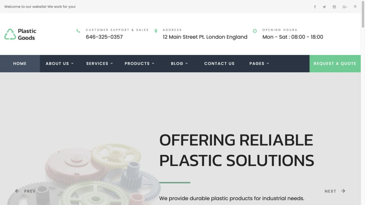
A pale product-led hero sits beneath a three-tier header. The illustration occupies the left half; uppercase Kanit copy occupies the right. Mint is reserved for quote actions, while muted sage supports service discovery. Broad white sections alternate with a flat slate services band and a charcoal footer. The interface is square, spacious and low-elevation: no pill buttons, rounded SaaS cards or decorative gradients. Desktop composition changes into copy-first, single-column content on phones without losing the product-and-process hierarchy.

## Tokens — Colors

| Name | Value | Token | Role |
|---|---|---|---|
| White Canvas | `#ffffff` | `--color-canvas` | Main background and secondary button fill |
| Soft Grey | `#f4f5f4` | `--color-soft` | Utility strip, product image panels and news band |
| Pale Product Field | `#e8ece9` | `--color-hero` | Full-width hero background |
| Heading Ink | `#212121` | `--color-ink` | Headings and light-surface labels |
| Body Grey | `#686868` | `--color-body` | Paragraphs, metadata and utility text on white |
| Quote Mint | `#45cd8f` | `--color-mint` | Quote CTA fill, dark-section icons and keyboard focus on dark surfaces |
| Service Sage | `#6da48b` | `--color-sage` | Service discovery button and horizontal accent rules |
| Action Ink | `#142c23` | `--color-action-ink` | Text on mint/sage buttons; hovered button background |
| Link Green | `#206844` | `--color-link` | Text links on light surfaces; do not use bright mint for body-sized links |
| Navigation Slate | `#26313d` | `--color-slate` | Navigation and service section |
| Navigation Active | `#354454` | `--color-nav-active` | Hover/current navigation-link background |
| Dark Divider | `#516371` | `--color-divider-on-dark` | Service-card and newsletter separators on dark surfaces |
| Footer Charcoal | `#2a2d31` | `--color-footer` | Newsletter and footer columns |
| Footer Base | `#22262a` | `--color-footer-bottom` | Copyright strip |
| Dark-Surface White | `#ffffff` | `--color-on-dark` | Headings and interactive text on dark surfaces |
| Dark-Surface Mute | `#d6dce0` | `--color-muted-on-dark` | Supporting text on dark surfaces |
| Fine Border | `#d3d9d6` | `--color-border` | Product-card outlines only |
| Control Border | `#7b827e` | `--color-control-border` | Input, select, textarea and secondary-button boundaries |
| Focus Green | `#155c42` | `--color-focus` | Visible keyboard focus on light surfaces |
| Success Green | `#155c42` | `--color-success` | Successful demonstration status indicator |
| Error Red | `#a82424` | `--color-error` | Invalid-field text and border |
| Error Tint | `#fff1f0` | `--color-error-bg` | Invalid input background |
| Dark-Surface Error | `#ffb4ab` | `--color-error-on-dark` | Newsletter inline error on charcoal |

Mint and sage controls use dark text. Keep the stated foreground/background pairs; white text on the bright mint fill is not part of this implementation.

## Tokens — Typography

### Kanit — Display family · `--font-heading`
- **Substitute:** Arial Narrow, then the platform sans-serif; Chinese text falls back to PingFang SC or Microsoft YaHei.
- **Weights:** 400 for H1/H2; 500 for occasional emphasis.
- **Sizes:** 60px hero and 40px section headings on desktop; 48/34px on tablet; 36/30px on phone.
- **Line height:** 1.2 for H1; 1.25 for H2.
- **Letter spacing:** H1 normal; H2 `-0.03em`.
- **Role:** Uppercase geometric display headings, never heavy 700–900 weight.

### Poppins — Body and interface family · `--font-body`
- **Substitute:** Helvetica Neue, Arial, platform sans-serif; use the declared Chinese fallbacks for Chinese content.
- **Weights:** 400 body and card titles; 500 controls/labels; 600 brand lockup.
- **Sizes:** 12, 14, 16, 18 and 24px.
- **Line height:** body 1.625; lead 1.445; card heading 1.3334.
- **Letter spacing:** body normal; uppercase button labels `0.12em`.
- **Role:** Readable specifications, navigation, forms and product metadata.

### Type Scale

| Role | Family | Weight | Size | Line Height | Letter Spacing | Token |
|---|---|---|---|---|---|---|
| caption | Poppins | 400 | 12px | 1.625 | normal | `--text-caption` |
| label / CTA | Poppins | 500 | 14px | 1.2 on buttons | 0.12em on buttons | `--text-label` |
| body | Poppins | 400 | 16px | 1.625 | normal | `--text-body` |
| lead | Poppins | 400 | 18px | 1.445 | normal | `--text-lead` |
| card heading | Poppins | 400 | 24px | 1.3334 | normal | `--text-card` |
| section | Kanit | 400 | 40px | 1.25 | -0.03em | `--text-section` |
| hero | Kanit | 400 | 60px | 1.2 | normal | `--text-hero` |

## Tokens — Spacing & Shapes

**Density:** spacious, with compact navigation and deliberately generous section separation.

### Spacing Scale

| Name | Value | Token |
|---|---|---|
| 4 | 4px | `--space-1` |
| 8 | 8px | `--space-2` |
| 12 | 12px | `--space-3` |
| 16 | 16px | `--space-4` |
| 24 | 24px | `--space-5` |
| 30 | 30px | `--space-6` |
| 40 | 40px | `--space-7` |
| 60 | 60px | `--space-8` |
| 80 | 80px | `--space-9` |
| 120 | 120px | `--space-10` |

### Border Radius

| Element | Value |
|---|---|
| Navigation / buttons / inputs | 0px |
| Product cards / service panels | 0px |
| Image frames / form status panels | 0px |

### Layout

- **Page max-width:** 1200px; viewport gutters 24px on desktop/tablet, 20px on phone.
- **Section padding:** 120px desktop, 80px tablet, 60px phone, on both vertical edges.
- **Grid gap:** 30px for products/news; 60px for major two-column splits and desktop services.
- **Control height:** at least 62px for buttons and inputs; phone navigation quote control at least 48px.
- **Hero minimum height:** 640px desktop, 544px tablet, content-driven on phone.
- **Accent rule:** 84 × 4px, sage, separated from adjacent copy by 30px.

## Components

### Utility Strip
Full-width soft-grey band; 12px Poppins. Use a short service statement on the left and a clearly labeled demonstration notice on the right. Hide the secondary item on phones. Do not include invented response times or geographic claims.

### Contact Masthead
White, 112px minimum height, contained within the page grid. Original text logo at left, up to three small contact facts at right. Labels use 12px uppercase tracking; values use 14px ink. Remove the last fact on tablet and all facts on phone; phone masthead is 80px tall. Class: `.masthead`; contact list: `.contact-facts` using `dl/dt/dd`.

### Slate Navigation with Quote Action
64px sticky slate band, placed after the header rather than inside it so the sticky behavior spans the full page. Navigation links are white, uppercase 14px/500; hover/current state uses the `#354454` background plus a 3px mint underline. A mint quote CTA occupies the right edge with dark action text. Desktop links: Overview, Services, Products, News, Contact. Below 64rem use a real button `.nav-toggle` controlling `.nav-links`; `aria-expanded` and `.nav-inner[data-open]` must agree. Escape closes the menu and returns focus to its toggle; selecting an anchor closes it. Do not use a fake dropdown chevron for a link without a submenu.

### Product-led Split Hero
Use `.hero > .container.hero-grid`, with `.hero-copy` first and `.hero-media` second in DOM order. Desktop columns are 1:1, separated by 60px; CSS grid places the media left and copy right. Put the heading, sage accent rule, 18px lead and two CTAs in the copy column. The image is a 5:4 contained original product illustration, without text inside the artwork. On phone, the DOM and visual order both remain copy then illustration, and both actions become full-width. Primary quote action links to `#rfq`; secondary service action links to `#services` and uses the white secondary treatment. No automatic carousel.

### Filled Action and Secondary Buttons
Use `.button.button-primary` for mint quote actions, `.button.button-service` for sage service discovery, and `.button.button-secondary` for white alternatives. All are square, 14px/500 uppercase with 0.12em tracking and 22px vertical × 36px horizontal desktop padding; at `≤63.99rem`, horizontal padding is 24px while vertical padding remains 22px. Hover changes fill to action ink and text to white; keyboard focus remains visible; active adds an inset line. Native disabled controls cannot activate. During submission add `aria-busy="true"`, disable the submit button and show a verb-based progress label.

### Overview Split
`.overview-grid` is a 1:1 two-column section: concise positioning and process information left, original manufacturing illustration right in `.overview-media`. Use a 40px section heading, an 18px lead and 16px body copy. Stack text before artwork on phone. Copy describes actual materials/processes; demonstration copy must not claim certifications, customers or production capacities.

### Six-service Grid
Use `.dark` on the full services section and `.service-grid` for six `.service-card` items. Desktop 3 columns × 2 rows; tablet 2 columns; phone 1 column. Each card has a 1px top rule, a 48px mint outline icon, 24px white title and pale supporting copy. Content areas: molding, tooling, prototyping, finishing, extrusion, assembly. Keep copy concise; no decorative elevated cards or image backgrounds. Focus within a card highlights its top border in mint.

### Product Application Card
Four `.product-card` items in `.product-grid`; 4 desktop columns, 2 tablet/phone columns, 1 below 22.49rem. Square product image on soft grey, thin border, 24px body padding; on phone use 16px padding. Include product-family name, material/application cue and a text inquiry link to `#rfq`. No prices, stars, stock claims or shopping cart. Hover/focus changes the outline to link green; content remains visible without hover.

### Three-column News List
`.news` uses a soft-grey band and `.news-grid` has three `.news-card` articles. Each begins with a 2px sage line, then a 24px dark-green linked heading, 16px summary and 12px date. Phone layout is one column. For the local demonstration, use original illustrative article copy, with dates and the sample label visibly identified as demo content; no fabricated customer milestones.

### RFQ Form
Use `.rfq-grid`: desktop columns 0.85fr/1.15fr, explanatory text left and `.form-grid` right. Fields: name, email, company, process (optional select), volume (optional), project brief. Name/email/company/brief are required. Associate each label and error with its control; invalid fields receive `aria-invalid="true"` and an error description ID. Empty submission shows inline errors and focuses the first invalid control. A valid demo submission disables its button for 650ms, then displays `.form-status[role="status"]` saying no request was sent. Preserve entered values. No real network submission is part of the demonstration.

### Newsletter and Four-column Footer
Charcoal background. Newsletter uses `.newsletter-grid`: explanation left, labeled email plus mint submit button right. The local demo validates email and displays a “nothing sent” status; it must not subscribe anyone. Below, `.footer-grid` has four groups: short brand description, services, resources, contact. Tablet/phone uses two columns; very narrow screens use one. The bottom copyright band is darker. Do not display vendor phone numbers, addresses or email.

## Do's and Don'ts

### Do
- Keep the pale hero, slate navigation/services and charcoal footer as the defining large surfaces.
- Use Kanit 400 uppercase for display, and Poppins for body/interface copy.
- Preserve square geometry, the 84px sage rule and the spacious 120/80/60px rhythm.
- Pair mint/sage fills with dark action text; use dark green for text links on light surfaces.
- Keep the product image left and copy right on desktop, reversing visual priority to copy-first on phone.
- Show a single clear quote path and accessible, labeled form feedback.
- Keep all language versions on the same token values and responsive rules.

### Don't
- Do not substitute a generic 12px-rounded card system or gradient SaaS hero.
- Do not make every accent mint: sage is the service/section accent; dark green is the light-surface link color.
- Do not add a shopping cart, fabricated testimonials, prices or certification logos.
- Do not hide product content behind hover, autoplay sliders or scroll-triggered reveal effects.
- Do not copy vendor HTML, CSS, icon fonts, photography, logo or promotional copy.
- Do not leave fake `href="#"` actions or report real submission success in the local demo.

## Surfaces

| Level | Name | Value | Purpose |
|---|---|---|---|
| 0 | White Canvas | `#ffffff` | Main reading surface |
| 1 | Soft Grey | `#f4f5f4` | Product image cells, utility and news |
| 2 | Pale Product Field | `#e8ece9` | Hero grouping |
| 3 | Slate | `#26313d` | Navigation and services |
| 4 | Charcoal | `#2a2d31` | Newsletter/footer |
| 5 | Footer Base | `#22262a` | Closing band |

## Elevation

- **Cards:** none; 1px borders or top rules define separation.
- **Buttons:** no floating shadow; active state uses an inset line.
- **Sticky navigation:** the only structural shadow, `0 8px 22px rgb(33 33 33 / 8%)`.
- **Focus:** 3px external outline with 4px offset; mint on dark surfaces, focus green on light surfaces.

## Imagery

Use original or approved product/manufacturing imagery, not screenshots of the reference site. The supplied local asset `assets/polymer-components.svg` is an original schematic illustration for the demonstration: sage/mint molded parts on a pale field. It is not a certified engineering drawing or a photograph of a real product. It may be reused across demo hero, overview and product cells with distinct accessible labels; use actual approved product photographs for a customer site.

Hero/overview frames are 5:4 with `object-fit: contain`; product frames are 1:1. Keep complete object outlines visible, with no text baked into imagery. Functional icons are original inline SVG, 24px for navigation and 48px for services, using roughly 2px strokes. Decorative SVGs use `aria-hidden="true"`; meaningful images have specific alt text.

## Layout

| Order | Region / anchor | Desktop composition | Phone composition |
|---|---|---|---|
| 1 | Utility / masthead / nav | Three horizontal bands; sticky nav only | Compact utility and brand; expandable nav |
| 2 | Hero `#home` | Artwork left, copy right, 1:1 | Copy then artwork; full-width actions |
| 3 | Overview `#overview` | Copy left, illustration right, 1:1 | Stacked, copy first |
| 4 | Services `#services` | Six services, 3 × 2 | Six single-column cards |
| 5 | Products `#products` | Four square image cards | Two columns; one on very narrow screens |
| 6 | News `#news` | Three editorial summaries | One column |
| 7 | RFQ `#rfq` | Introduction + two-column form | Introduction + one-column form |
| 8 | Newsletter / footer | Newsletter split, four footer columns | Newsletter stacked, two footer columns |

Responsive rules: default above 63.99rem; tablet at `max-width: 63.99rem`; phone at `max-width: 47.99rem`; extra-narrow stacking at `max-width: 22.49rem`. The CSS is authoritative. At 1440px the content container is 1200px; at 390px it is up to 350px, reduced by any width reserved for a classic scrollbar. Gutters are measured from the available content viewport. No horizontal viewport overflow is permitted. Section spacing and heading sizes must change with the same root tokens, not independent hard-coded overrides. Under reduced motion, disable smooth scrolling and animations without disabling controls.

## Agent Prompt Guide

**Quick Color Reference**
- Canvas: `#ffffff`; hero: `#e8ece9`; alternate light: `#f4f5f4`.
- Headings: `#212121`; body: `#686868`; light-surface links: `#206844`.
- Quote fill: `#45cd8f`; service fill/rules: `#6da48b`; both use `#142c23` text.
- Navigation/services: `#26313d`; hover/current navigation: `#354454` with a mint underline; dark dividers: `#516371`; footer: `#2a2d31`; dark-surface text: white or `#d6dce0`.
- Demonstration success: `#155c42`.

**Example Component Prompts**

1. **Hero:** Build the `.hero-grid` structure from this document with `.hero-copy` before `.hero-media` in the DOM. On desktop, use CSS grid to place the supplied original illustration left and a 60px/72px Kanit 400 uppercase heading right. Add an 84×4px sage rule, 18px lead, mint quote action and white secondary service action. Keep the pale `#e8ece9` surface. On phone retain copy then media and use 36px heading type.
2. **Services:** Render six plain service items on slate, with 48px mint outline icons, 24px white Poppins titles, pale supporting text and the white secondary CTA where a second service action is needed. Apply the 3→2→1 column rules from the supplied CSS, not an unrelated card layout.
3. **RFQ:** Implement only the fields and demo state sequence specified above. Label every field, link inline errors with `aria-describedby`, preserve values and announce the result. Never send a request in the sample.
4. **Blind implementation:** Read only this document and the supplied `assets/` directory. Create new semantic HTML/JavaScript; copy the Quick Start stylesheet exactly. Do not read an existing page implementation or the author's source files. Check 1440×1000 and 390×844, menu open/close/Escape, form invalid/busy/success and reduced motion. Add a visible fictional-demo label.

## Similar Brands

- **BASF:** A content-organization analogue for navigating industrial products by industry and material group, not a color or typography reference. [Official product directory](https://www.basf.com/global/en/products).
- **Plastic Goods:** The visual reference for the mint/sage palette, square industrial interface and geometric display typography. [Reference preview](https://livedemo00.template-help.com/wt_62319/). This implementation supplies its own code, artwork, copy and responsive behavior.

## Quick Start

### CSS Custom Properties

Use this complete stylesheet as-is. All component classes below belong to this implementation; no vendor CSS is required. By default, its leading `@import` loads Kanit (400, 500) and Poppins (400, 500, 600) from Google Fonts. Before a production project, review the font service against that project’s CSP and privacy requirements. If Google Fonts is not approved, replace the import with the project-approved self-hosted or provider source while preserving the stated families, weights and fallbacks. Tailwind is optional, not a runtime dependency.

```css
@import url("https://fonts.googleapis.com/css2?family=Kanit:wght@400;500&family=Poppins:wght@400;500;600&display=swap");

:root {
  color-scheme: light;
  --color-canvas: #ffffff;
  --color-soft: #f4f5f4;
  --color-hero: #e8ece9;
  --color-ink: #212121;
  --color-body: #686868;
  --color-mint: #45cd8f;
  --color-sage: #6da48b;
  --color-action-ink: #142c23;
  --color-link: #206844;
  --color-slate: #26313d;
  --color-nav-active: #354454;
  --color-divider-on-dark: #516371;
  --color-footer: #2a2d31;
  --color-footer-bottom: #22262a;
  --color-on-dark: #ffffff;
  --color-muted-on-dark: #d6dce0;
  --color-border: #d3d9d6;
  --color-control-border: #7b827e;
  --color-focus: #155c42;
  --color-error: #a82424;
  --color-error-bg: #fff1f0;
  --color-error-on-dark: #ffb4ab;
  --color-success: #155c42;
  --font-heading: "Kanit", "Arial Narrow", "PingFang SC", "Microsoft YaHei", sans-serif;
  --font-body: "Poppins", "Helvetica Neue", "PingFang SC", "Microsoft YaHei", Arial, sans-serif;
  --text-caption: 0.75rem;
  --text-label: 0.875rem;
  --text-body: 1rem;
  --text-lead: 1.125rem;
  --text-card: 1.5rem;
  --text-section: 2.5rem;
  --text-hero: 3.75rem;
  --leading-body: 1.625;
  --leading-lead: 1.445;
  --leading-card: 1.3334;
  --leading-section: 1.25;
  --leading-hero: 1.2;
  --tracking-label: 0.12em;
  --tracking-section: -0.03em;
  --weight-normal: 400;
  --weight-ui: 500;
  --weight-strong: 600;
  --space-1: 0.25rem;
  --space-2: 0.5rem;
  --space-3: 0.75rem;
  --space-4: 1rem;
  --space-5: 1.5rem;
  --space-6: 1.875rem;
  --space-7: 2.5rem;
  --space-8: 3.75rem;
  --space-9: 5rem;
  --space-10: 7.5rem;
  --layout-max: 75rem;
  --layout-gutter: 1.5rem;
  --section-space: 7.5rem;
  --hero-min-height: 40rem;
  --control-height: 3.875rem;
  --radius-control: 0px;
  --radius-card: 0px;
  --border-thin: 1px;
  --focus-width: 3px;
  --shadow-header: 0 8px 22px rgb(33 33 33 / 8%);
  --motion-fast: 160ms;
  --motion-normal: 240ms;
  --ease-ui: cubic-bezier(0.2, 0.6, 0.3, 1);
}

* { box-sizing: border-box; }
html { scroll-behavior: smooth; scroll-padding-top: 5rem; }
body { margin: 0; font: var(--weight-normal) var(--text-body)/var(--leading-body) var(--font-body); color: var(--color-body); background: var(--color-canvas); }
img, svg { display: block; max-width: 100%; }
button, input, select, textarea { font: inherit; }
button, a, input, select, textarea { -webkit-tap-highlight-color: transparent; }
button, a { touch-action: manipulation; }
a { color: var(--color-link); text-underline-offset: 0.2em; }
a:hover { text-decoration-thickness: 2px; }
:focus-visible { outline: var(--focus-width) solid var(--color-focus); outline-offset: 4px; }
[hidden] { display: none !important; }
h1, h2, h3, p { margin-top: 0; }
h1, h2 { font-family: var(--font-heading); font-weight: var(--weight-normal); color: var(--color-ink); text-transform: uppercase; }
h1 { font-size: var(--text-hero); line-height: var(--leading-hero); }
h2 { font-size: var(--text-section); line-height: var(--leading-section); letter-spacing: var(--tracking-section); margin-bottom: var(--space-5); }
h3 { font-size: var(--text-card); line-height: var(--leading-card); font-weight: var(--weight-normal); color: var(--color-ink); }
p { margin-bottom: var(--space-5); }
.container { width: min(calc(100% - 2 * var(--layout-gutter)), var(--layout-max)); margin-inline: auto; }
.section { padding-block: var(--section-space); }
.section-heading { max-width: 48rem; margin: 0 auto var(--space-8); text-align: center; }
.section-heading p { margin-bottom: 0; }
.eyebrow { font-size: var(--text-caption); letter-spacing: var(--tracking-label); font-weight: var(--weight-ui); text-transform: uppercase; }
.lead { font-size: var(--text-lead); line-height: var(--leading-lead); color: var(--color-ink); }
.accent-rule { width: 5.25rem; height: 4px; margin-block: var(--space-6); background: var(--color-sage); }
.skip-link { position: fixed; left: 1rem; top: -10rem; z-index: 100; padding: 1rem; background: white; color: var(--color-ink); }
.skip-link:focus { top: 1rem; }
.demo-label { font-size: var(--text-caption); letter-spacing: 0.03em; }

.utility { background: var(--color-soft); font-size: var(--text-caption); padding-block: var(--space-2); }
.utility .container { display: flex; justify-content: space-between; gap: var(--space-5); }
.masthead { background: var(--color-canvas); }
.masthead .container { min-height: 7rem; display: flex; align-items: center; justify-content: space-between; gap: var(--space-6); }
.brand { color: var(--color-ink); text-decoration: none; display: inline-flex; align-items: center; gap: var(--space-3); font-size: 1.25rem; font-weight: var(--weight-strong); line-height: 1.2; }
.brand-mark { width: 2.5rem; height: 2.5rem; color: var(--color-link); }
.contact-facts { display: flex; gap: var(--space-7); margin: 0; }
.contact-facts div { display: grid; gap: var(--space-1); }
.contact-facts dt { font-size: var(--text-caption); letter-spacing: var(--tracking-label); text-transform: uppercase; }
.contact-facts dd { margin: 0; color: var(--color-ink); font-size: var(--text-label); }
.site-nav { position: sticky; top: 0; z-index: 20; background: var(--color-slate); box-shadow: var(--shadow-header); }
.nav-inner { min-height: 4rem; display: flex; align-items: stretch; justify-content: space-between; }
.nav-links { display: flex; align-items: stretch; padding: 0; margin: 0; list-style: none; }
.nav-links a { display: flex; align-items: center; min-height: 4rem; padding: var(--space-4) var(--space-5); color: var(--color-on-dark); text-decoration: none; text-transform: uppercase; font-size: var(--text-label); font-weight: var(--weight-ui); letter-spacing: 0.08em; transition: background var(--motion-fast) var(--ease-ui); }
.nav-links a:hover, .nav-links a[aria-current="page"] { background: var(--color-nav-active); text-decoration: underline; text-decoration-color: var(--color-mint); text-decoration-thickness: 3px; text-underline-offset: 0.4em; }
.site-nav :focus-visible, .dark :focus-visible, .site-footer :focus-visible { outline-color: var(--color-mint); }
.nav-quote { display: inline-flex; align-items: center; justify-content: center; min-height: 4rem; padding: var(--space-4) var(--space-5); background: var(--color-mint); color: var(--color-action-ink); font-size: var(--text-label); font-weight: var(--weight-ui); text-transform: uppercase; letter-spacing: 0.08em; text-decoration: none; }
.nav-toggle { display: none; }

.hero { background: var(--color-hero); }
.hero-grid { min-height: var(--hero-min-height); display: grid; grid-template-columns: 1fr 1fr; align-items: center; gap: var(--space-8); padding-block: var(--space-8); }
.hero-media { min-width: 0; grid-column: 1; grid-row: 1; }
.hero-media img { width: 100%; aspect-ratio: 5/4; object-fit: contain; }
.hero-copy { min-width: 0; grid-column: 2; grid-row: 1; }
.hero-copy h1 { margin-bottom: 0; max-width: 12ch; overflow-wrap: normal; }
.hero-copy .lead { max-width: 34rem; }
.actions { display: flex; flex-wrap: wrap; gap: var(--space-4); margin-top: var(--space-7); }
.button { display: inline-flex; justify-content: center; align-items: center; gap: var(--space-2); min-height: var(--control-height); border: var(--border-thin) solid transparent; padding: 1.375rem 2.25rem; border-radius: var(--radius-control); font-size: var(--text-label); line-height: 1.2; font-weight: var(--weight-ui); letter-spacing: var(--tracking-label); text-transform: uppercase; text-decoration: none; cursor: pointer; transition: background var(--motion-normal) var(--ease-ui), color var(--motion-normal) var(--ease-ui), border-color var(--motion-normal) var(--ease-ui); }
.button-primary { background: var(--color-mint); color: var(--color-action-ink); }
.button-service { background: var(--color-sage); color: var(--color-action-ink); }
.button-secondary { background: var(--color-canvas); color: var(--color-ink); border-color: var(--color-control-border); }
.button:hover, .nav-quote:hover { background: var(--color-action-ink); color: var(--color-on-dark); border-color: var(--color-action-ink); }
.button:active { box-shadow: inset 0 0 0 2px currentColor; }
.button:disabled, .button[aria-disabled="true"] { opacity: 0.55; cursor: not-allowed; pointer-events: none; }
.button[aria-busy="true"] { cursor: progress; }

.overview-grid { display: grid; grid-template-columns: 1fr 1fr; gap: var(--space-8); align-items: center; }
.overview-media { background: var(--color-soft); padding: var(--space-7); }
.overview-media img { width: 100%; aspect-ratio: 5/4; object-fit: contain; }
.dark { background: var(--color-slate); color: var(--color-muted-on-dark); }
.dark h2, .dark h3 { color: var(--color-on-dark); }
.service-grid { display: grid; grid-template-columns: repeat(3, minmax(0,1fr)); column-gap: var(--space-8); row-gap: var(--space-8); }
.service-card { padding-top: var(--space-5); border-top: 1px solid var(--color-divider-on-dark); border-radius: var(--radius-card); }
.service-icon { color: var(--color-mint); width: 3rem; height: 3rem; margin-bottom: var(--space-5); }
.service-card h3 { margin-bottom: var(--space-4); }
.service-card p { margin-bottom: 0; }
.service-card a { color: var(--color-on-dark); text-decoration-color: var(--color-mint); }
.service-card:focus-within { border-top-color: var(--color-mint); }
.product-grid { display: grid; grid-template-columns: repeat(4,minmax(0,1fr)); gap: var(--space-6); }
.product-card { border: 1px solid var(--color-border); border-radius: var(--radius-card); background: var(--color-canvas); overflow: hidden; }
.product-card img { width: 100%; aspect-ratio: 1/1; object-fit: contain; background: var(--color-soft); padding: var(--space-5); }
.product-card-body { padding: var(--space-5); }
.product-card h3 { font-size: var(--text-lead); line-height: 1.45; margin-bottom: var(--space-2); }
.product-card p { font-size: var(--text-label); margin-bottom: var(--space-4); }
.product-card a { font-weight: var(--weight-ui); }
.product-card:hover, .product-card:focus-within { border-color: var(--color-link); }
.news { background: var(--color-soft); }
.news-grid { display: grid; grid-template-columns: repeat(3,minmax(0,1fr)); gap: var(--space-6); }
.news-card { padding-top: var(--space-5); border-top: 2px solid var(--color-sage); }
.news-card h3 { margin-bottom: var(--space-4); }
.news-card h3 a { text-decoration: none; }
.news-card time { display: block; font-size: var(--text-caption); margin-top: var(--space-5); color: var(--color-body); }
.news-card p { margin: 0; }

.rfq-grid { display: grid; grid-template-columns: 0.85fr 1.15fr; gap: var(--space-8); }
.form-grid { display: grid; grid-template-columns: 1fr 1fr; gap: var(--space-5); }
.field { display: grid; gap: var(--space-2); align-content: start; }
.field-wide { grid-column: 1/-1; }
.field label { color: var(--color-ink); font-size: var(--text-label); font-weight: var(--weight-ui); }
.field input, .field select, .field textarea { width: 100%; min-width: 0; min-height: var(--control-height); padding: var(--space-4); background: var(--color-canvas); color: var(--color-ink); border: var(--border-thin) solid var(--color-control-border); border-radius: var(--radius-control); }
.field textarea { min-height: 9rem; resize: vertical; }
.field input:focus, .field textarea:focus, .field select:focus { border-color: var(--color-focus); }
.field [aria-invalid="true"] { border-color: var(--color-error); background: var(--color-error-bg); }
.field-error { color: var(--color-error); font-size: var(--text-label); margin: 0; }
.form-status { padding: var(--space-4); border-left: 4px solid var(--color-success); background: var(--color-soft); color: var(--color-success); margin-top: var(--space-5); }
.form-note { font-size: var(--text-label); margin-block: var(--space-5) 0; }
.site-footer { background: var(--color-footer); color: var(--color-muted-on-dark); }
.newsletter-grid { display: grid; grid-template-columns: 1fr 1fr; gap: var(--space-8); align-items: end; padding-block: var(--space-8); border-bottom: 1px solid var(--color-divider-on-dark); }
.site-footer h2, .site-footer h3, .site-footer .brand { color: var(--color-on-dark); }
.site-footer h2 { font-size: var(--text-section); }
.newsletter-form { display: flex; align-items: end; gap: var(--space-4); flex-wrap: wrap; }
.newsletter-form .field { flex: 1 1 12rem; }
.newsletter-form .field label { color: var(--color-on-dark); }
.newsletter-form .field-error { color: var(--color-error-on-dark); }
.newsletter-form .form-status { flex-basis: 100%; }
.footer-grid { display: grid; grid-template-columns: 1.3fr 1fr 1fr 1.2fr; gap: var(--space-6); padding-block: var(--space-8); }
.footer-grid h3 { font-size: var(--text-label); font-weight: var(--weight-ui); letter-spacing: 0.08em; text-transform: uppercase; }
.footer-grid ul { padding: 0; list-style: none; margin: 0; }
.footer-grid li + li { margin-top: var(--space-3); }
.footer-grid a { color: var(--color-muted-on-dark); }
.footer-bottom { background: var(--color-footer-bottom); padding-block: var(--space-5); font-size: var(--text-caption); }
.footer-bottom p { margin: 0; }

@media (max-width: 63.99rem) {
  :root { --text-hero: 3rem; --text-section: 2.125rem; --section-space: 5rem; --hero-min-height: 34rem; }
  .contact-facts { gap: var(--space-5); }
  .contact-facts div:last-child { display: none; }
  .nav-inner { flex-wrap: wrap; align-items: center; }
  .nav-toggle { display: inline-flex; align-items: center; gap: var(--space-3); min-height: 4rem; padding: var(--space-4); border: 0; background: transparent; color: var(--color-on-dark); cursor: pointer; font-size: var(--text-label); }
  .nav-links { display: none; width: 100%; flex-direction: column; order: 3; padding-bottom: var(--space-4); }
  .nav-inner[data-open="true"] .nav-links { display: flex; }
  .nav-links a { min-height: 3rem; }
  .nav-quote { margin-left: auto; }
  .hero-grid { gap: var(--space-6); }
  .button { padding-inline: var(--space-5); }
  .service-grid { grid-template-columns: repeat(2,minmax(0,1fr)); gap: var(--space-7); }
  .product-grid { grid-template-columns: repeat(2,minmax(0,1fr)); }
  .overview-grid, .rfq-grid, .newsletter-grid { gap: var(--space-7); }
  .news-grid { gap: var(--space-5); }
  .footer-grid { grid-template-columns: repeat(2,minmax(0,1fr)); }
}

@media (max-width: 47.99rem) {
  :root { --text-hero: 2.25rem; --text-section: 1.875rem; --text-card: 1.25rem; --layout-gutter: 1.25rem; --section-space: 3.75rem; --hero-min-height: auto; }
  html { scroll-padding-top: 4.5rem; }
  .utility .container > :last-child { display: none; }
  .masthead .container { min-height: 5rem; }
  .contact-facts { display: none; }
  .brand { font-size: 1.125rem; }
  .brand-mark { width: 2.125rem; height: 2.125rem; }
  .nav-inner { width: 100%; padding-inline: var(--layout-gutter); }
  .nav-quote { min-height: 3rem; font-size: var(--text-caption); padding: var(--space-3); }
  .hero-grid { grid-template-columns: 1fr; gap: var(--space-7); padding-block: var(--space-7); }
  .hero-copy, .hero-media { grid-column: auto; grid-row: auto; }
  .hero-copy h1 { max-width: 15ch; }
  .hero-media { max-width: 30rem; margin-inline: auto; width: 100%; }
  .actions { gap: var(--space-3); margin-top: var(--space-6); }
  .actions .button { width: 100%; }
  .overview-grid, .rfq-grid, .newsletter-grid, .news-grid { grid-template-columns: 1fr; }
  .section-heading { margin-bottom: var(--space-7); }
  .service-grid { grid-template-columns: 1fr; gap: var(--space-7); }
  .product-grid { gap: var(--space-4); }
  .product-card-body { padding: var(--space-4); }
  .product-card h3 { font-size: var(--text-body); }
  .product-card p { font-size: var(--text-caption); }
  .form-grid { grid-template-columns: 1fr; }
  .newsletter-form { flex-direction: column; align-items: stretch; }
  .newsletter-form .field { flex-basis: auto; }
  .newsletter-form .button { width: 100%; }
  .footer-grid { gap: var(--space-7); }
}

@media (max-width: 22.49rem) {
  .product-grid, .footer-grid { grid-template-columns: 1fr; }
}

@media (prefers-reduced-motion: reduce) {
  html { scroll-behavior: auto; }
  *, *::before, *::after { animation: none !important; transition-duration: 0.01ms !important; }
}
```

### Tailwind v4

Optional compiler integration: keep the complete stylesheet above and add these aliases to your Tailwind v4 entry file. They reference the same tokens, not a second palette. Process this block with Tailwind; do not paste the compiler import into a plain browser stylesheet. The `inline` mapping follows the [official theme-variable guidance](https://tailwindcss.com/docs/theme#referencing-other-variables).

```css
@import "tailwindcss";
/* Load the complete stylesheet above after Tailwind's reset. */
@theme inline {
  --color-action: var(--color-mint);
  --color-action-foreground: var(--color-action-ink);
  --color-copy: var(--color-body);
  --color-panel: var(--color-soft);
  --color-navigation: var(--color-slate);
  --font-display: var(--font-heading);
  --font-copy: var(--font-body);
  --radius-panel: var(--radius-card);
  --spacing-section: var(--section-space);
}
```