# Organo — Style Reference
> A fictional produce-market storefront adapted from observed B2C patterns.

**Theme:** light commerce

This is an original, implementation-ready B2C storefront adaptation. It defines the accessible responsive behavior, visual tokens and component contracts for the fictional Verdant Basket demonstration; all products, copy and offers are fictional. Keep the shopping model: category discovery, product shelf, favorites and a local shopping bag.

## Tokens — Colors

| Name | Value | Token | Role |
|---|---|---|---|
| Canvas | `#ffffff` | `--color-canvas` | Reading and card surface |
| Soft Market | `#f7f8f4` | `--color-surface` | Product cells and outer hero canvas |
| Ink | `#333333` | `--color-ink` | Accessible primary light-surface text |
| Muted | `#66706a` | `--color-muted` | Secondary copy |
| Market Lime | `#85c32d` | `--color-lime` | Primary B2C actions and selected tabs |
| Lime Dark | `#4d790c` | `--color-lime-dark` | Accessible text/link and hover treatment |
| Lime Tint | `#edf6df` | `--color-lime-tint` | Category and newsletter field |
| Night Footer | `#1f2125` | `--color-footer` | Footer and dark hero |
| Footer Mute | `#cfd2d0` | `--color-footer-muted` | Supporting text on night surface |
| Border | `#dce1da` | `--color-border` | Decorative card edges and separators only |
| Control Border | `#6f7871` | `--color-control-border` | Inputs, search, filter, favorite, quantity and secondary-button boundaries; at least 3:1 against canvas, soft market and lime tint |
| Error | `#b42318` | `--color-error` | Errors and unavailable stock |
| Error Tint | `#fff1f0` | `--color-error-bg` | Invalid field background |
| Success | `#1f6b35` | `--color-success` | Local confirmation text |
| Control Ink | `#17200d` | `--color-action-ink` | Lime-label and dark navigation text |
| Dark Category | `#2c351f` | `--color-category-dark` | Category-entry contrast surface |
| Dark Focus | `#d7ff93` | `--color-focus-on-dark` | Focus outline for dark hero/footer; exceeds 3:1 against night |

Use dark text on lime and white on the dark hero/footer. Do not use white body text on lime or low-contrast pale grey body copy.

## Tokens — Typography

### Inter — display/interface · `--font-heading`
- **Weights:** 600 and 700; headings and shopping controls.
- **Sizes:** 14 and 18px controls/cards; 32px section; 52px default hero. The 36px phone hero is declared separately by the responsive `:root` override.
- **Role:** firm, compact retail hierarchy.

### Roboto — body · `--font-body`
- **Weights:** 400 and 500; product metadata, paragraphs, field text.
- **Sizes:** 12, 14 and 16px; body line-height 1.6.

### Type Scale

| Role | Family | Weight | Size | Line height | Token |
|---|---|---:|---:|---:|---|
| caption | Roboto | 400 | 12px | 1.4 | `--text-caption` |
| label | Inter | 600 | 14px | 1.2 | `--text-label` |
| body | Roboto | 400 | 16px | 1.6 | `--text-body` |
| card | Inter | 700 | 18px | 1.3 | `--text-card` |
| section | Inter | 700 | 32px | 1.2 | `--text-section` |
| hero | Inter | 700 | 52px | 1.12 | `--text-hero` |

## Tokens — Spacing & Shapes

Use a 1200px content maximum, 24px desktop and 16px phone gutters. Section padding is 80px desktop and 60px phone. Cards are 10px rounded; actions, search and quantity controls are 50px/pill. This rounded retail language is intentional and must not be substituted with square industrial UI.

### Spacing Scale

| Value | Token | Use |
|---:|---|---|
| 8px | `--space-1` | compact gaps |
| 16px | `--space-2` | card padding |
| 24px | `--space-3` | grid gap |
| 32px | `--space-4` | component separation |
| 48px | `--space-5` | panel padding |
| 80px | `--space-6` | desktop sections |

### Border Radius

| Element | Value | Token |
|---|---:|---|
| Product / promo / dialog card | 10px | `--radius-card` |
| Search, buttons, quantity, controls | 999px | `--radius-pill` |
| Hero frame | 10px | `--radius-card` |

### Layout

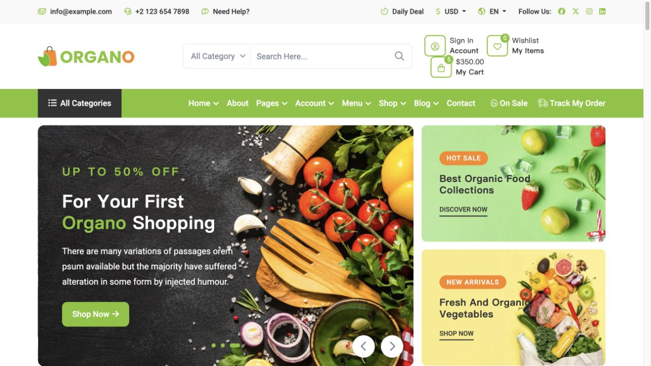
The `.site-header` uses a lime category strip with dark accessible labels, followed by a bounded dark hero inside the normal canvas rather than an edge-to-edge B2B band. Desktop uses a 1200px container, four shelf columns and six circular categories. At 390px it uses 16px gutters, two shelf columns and categories that automatically wrap; no category is hidden.

## Components

### Header, category navigation and search

Use `.site-header` with `.utility-bar`, `.header-main`, category `.category-nav`, a `.search-form` containing a real `<label for>` and input, and icon-only `button`s that have accessible names. Use `.sr-only` to visually hide that label or a polite live region without using `hidden`; it remains available to assistive technology. Below 1024px the search form occupies its own full-width second row; its input uses `min-width:0` and flexible sizing. Do not compress the search input beside the brand. The bag control owns `.cart-count` and opens `dialog.cart-dialog`. Navigation is category discovery, not B2B services.

Search normalizes a trimmed, case-insensitive query and combines it with the selected category tab using AND logic. On each input or selected-tab change it renders matching shelf items and updates a polite result count. `.search-clear` is visible and enabled only for a non-empty query; it clears the query, returns focus to the search input and restores the selected category result set. A zero-match state is visible in the panel, says “No fictional products match this search,” and provides a clear-search button. Search never makes a network request.

### Dark product hero and promotional tiles

`.hero-grid` is a bounded 10px-radius dark `#1f2125` panel with copy and `.hero-art` using `assets/produce-market.svg`; it contains one lime shopping CTA. Follow it with exactly two `.promo-tile` panels: a seasonal collection cue and a recipe/produce cue; no countdown, discount guarantee or certification claim.

### Circular categories and product shelf

`.category-list` contains six named category links with circular imagery. `.filter-tabs` uses real buttons with `role="tab"`, `aria-selected`, `aria-controls`, and a matching `role="tabpanel"`. Apply roving `tabindex`: only the selected tab has `tabindex="0"`; all other tabs have `-1`. Left/Right arrows move focus cyclically, Home moves to the first tab, End moves to the last tab, and each movement automatically activates the focused tab, updates its panel and updates the search result set. A six-to-eight fictional-product `.product-grid` includes name, category, price, favorite control and add button. Include at least one `out-of-stock` item whose add button is natively disabled; never invent ratings or reviews.

### Product actions and states

`.favorite` is a button using `aria-pressed`; its state persists only while the page is open. An enabled add button immediately becomes disabled with `aria-busy="true"` and label “Adding…” for exactly 300ms. During that interval duplicate activation is ignored. At completion it increments the in-memory line while the entire bag total remains at or below 99, updates the bag count and announces “Added [product] to bag” through a polite `.sr-only` live region. If adding would make the whole bag exceed 99, do not alter the bag; show the explicit local error “Bag limit is 99 items for this demo.” A successful add says “Bag updated locally; nothing was sent.” Out-of-stock buttons are native `disabled` from first render.

### Native shopping-bag dialog

Use `<dialog class="cart-dialog">`, opened with `showModal()`. Store the opener and return focus to it after the dialog `close` event, including native Escape. Its `.cart-line` contains `.cart-line-media`, `.cart-line-details`, `.quantity-control`, and `.remove-button`, plus image, name, unit price and `.cart-total`. Quantity is constrained to integer 1–99 per line and the whole bag total is also capped at 99: minus is disabled at 1; plus is disabled at 99 and cannot activate an error. Only an enabled product-shelf add action that would make the whole bag exceed 99 shows the explicit “Bag limit is 99 items for this demo.” error. At 390px `.cart-line` is a two-column grid: 64px media plus a flexible details column; quantity/remove occupy the second column, and dialog padding is 16px so its 358px viewport width does not overflow. Prices and totals are stored/calculated as integer cents and formatted only at rendering. Removing a line moves focus to that line’s next remove control, otherwise previous remove control, otherwise the dialog close button. Removing the final line renders “Your demo bag is empty” and focuses the close button. All data is in memory only: no network API, cookie or localStorage.

### Newsletter and footer

`.newsletter` has one labeled email field, a lime submit button and inline `.field-error` / `.form-status`. Valid local submission says that no subscription was created. Footer columns cover a fictional brand description, categories, help links and contact placeholder; do not add real addresses, trust marks, reviews or guarantees.

## Do's and Don'ts

### Do

- Do retain the B2C browsing-to-bag path, rounded cards and lime retail accent.
- Do use Inter 700 for headings and Roboto for body copy.
- Do make controls keyboard-visible, stateful and readable at 390px.
- Do use only fictional products such as Orchard Apples, River Spinach, Sunroot Carrots, Meadow Oats, Citrus Blend, Garden Peas, Stonefruit Jam and sold-out Field Mushrooms.

### Don't
- Do not turn the shopping bag into RFQ, checkout or lead collection.
- Do not use source logos, photographs, product claims, countdowns, ratings, certification badges or copied marketing text.
- Do not use localStorage or network submission in the demonstration.

## Surfaces

| Level | Surface | Value | Purpose |
|---|---|---|---|
| 0 | Canvas | `#ffffff` | Main shelf |
| 1 | Soft market | `#f7f8f4` | Product-image background |
| 2 | Lime tint | `#edf6df` | Category/newsletter field |
| 3 | Night | `#1f2125` | Hero/footer |

## Elevation

Product cards use `0 8px 24px rgb(28 38 24 / 8%)`; panels otherwise remain flat. Hover may lift a card by 2px only if reduced-motion permits. Focus is a 3px dark-green outline with 3px offset on light surfaces; Hero/footer focus uses `#d7ff93`. Buttons have no ambient shadow and use an inset active line.

## Imagery

The required path is `assets/produce-market.svg`. It is a generic original produce-market illustration, not a product photograph, inventory record, certification image or source-site asset. Use it for hero, category and product placeholders with context-specific alt text; production requires approved product imagery.

## Layout

At 1440px the `.container` is 1200px wide: the bounded hero uses 1.1/0.9 columns, categories use six circles, and shelf cards use four columns. At 390px gutters are 16px, hero and newsletter stack, categories automatically wrap to three columns, products use two, and `.hero-copy` uses 24px top/bottom with 16px inline padding. No horizontal overflow. These are adaptation decisions, not source measurement assertions.

## Agent Prompt Guide

**Quick Color Reference**

- Canvas `#ffffff`; primary ink `#333333`; muted `#66706a`.
- Action lime `#85c32d` with dark `#17200d` label; dark hover `#4d790c` with white label.
- Dark hero/footer `#1f2125`; dark focus `#d7ff93`; error `#b42318`; control boundaries `#6f7871`.

**Example Component Prompts**

1. **Shelf:** Build `.product-grid` with 6–8 fictional items, real button states, one sold-out disabled item, and no ratings.
2. **Bag:** Use native `<dialog>`, `showModal()`, a focus-return opener, keyboard-operable quantity/removal, in-memory total and polite announcements.
3. **Newsletter:** Validate a labeled email locally; error and successful local status are inline and do not create a subscription.

## Similar Brands

- [Organo reference](https://live.themewild.com/organo/) is the sole organizational source reference; do not copy its marks, product photography, copy or claims.

## Quick Start

### CSS Custom Properties

Use the complete stylesheet below as-is. Its leading `@import` loads Inter and Roboto from Google Fonts by default. Before production, review that provider against the project CSP, privacy and font-license requirements; replace the import with an approved self-hosted/provider source if necessary while preserving the defined fallback families. The stylesheet includes responsive, motion, focus and disabled-state rules for this adaptation.

```css
@import url("https://fonts.googleapis.com/css2?family=Inter:wght@400;500;600;700&family=Roboto:wght@400;500&display=swap");

:root {
  color-scheme: light;
  --color-canvas:#ffffff; --color-surface:#f7f8f4; --color-ink:#333333; --color-muted:#66706a; --color-lime:#85c32d; --color-lime-dark:#4d790c; --color-lime-tint:#edf6df; --color-footer:#1f2125; --color-footer-muted:#cfd2d0; --color-border:#dce1da; --color-control-border:#6f7871; --color-error:#b42318; --color-error-bg:#fff1f0; --color-success:#1f6b35; --color-action-ink:#17200d; --color-category-dark:#2c351f; --color-focus-on-dark:#d7ff93;
  --font-heading:"Inter",Arial,sans-serif; --font-body:"Roboto",Arial,sans-serif; --text-caption:.75rem; --text-label:.875rem; --text-body:1rem; --text-card:1.125rem; --text-section:2rem; --text-hero:3.25rem;
  --layout-max:75rem; --gutter:1.5rem; --space-1:.5rem; --space-2:1rem; --space-3:1.5rem; --space-4:2rem; --space-5:3rem; --space-6:5rem; --radius-card:.625rem; --radius-pill:999px; --control-height:3.125rem; --hero-min-height:32rem; --shadow-card:0 8px 24px rgb(28 38 24 / 8%); --focus:3px solid #315e0d;
}
*{box-sizing:border-box}html{scroll-behavior:smooth}body{margin:0;background:var(--color-canvas);color:var(--color-ink);font:400 var(--text-body)/1.6 var(--font-body)}img,svg{display:block;max-width:100%}button,input{font:inherit}button,a{touch-action:manipulation}a{color:inherit}:focus-visible{outline:var(--focus);outline-offset:3px}[hidden]{display:none!important}.container{width:min(calc(100% - 2 * var(--gutter)),var(--layout-max));margin:auto}.eyebrow{font:600 var(--text-label)/1.2 var(--font-heading);letter-spacing:.08em;text-transform:uppercase;color:var(--color-lime-dark)}h1,h2,h3{font-family:var(--font-heading);color:var(--color-ink);margin:0}h1{font-size:var(--text-hero);line-height:1.12;font-weight:700}h2{font-size:var(--text-section);line-height:1.2;font-weight:700}h3{font-size:var(--text-card);line-height:1.3;font-weight:700}.section{padding-block:var(--space-6)}.section-heading{display:flex;align-items:end;justify-content:space-between;gap:var(--space-3);margin-bottom:var(--space-4)}
.site-header{border-bottom:1px solid var(--color-border);background:#fff}.utility-bar{background:var(--color-footer);color:var(--color-footer-muted);font-size:var(--text-caption)}.utility-bar .container,.header-main,.category-nav{display:flex;align-items:center;justify-content:space-between;gap:var(--space-2)}.utility-bar .container{min-height:2rem}.header-main{min-height:5.25rem}.brand{font:700 1.25rem/1 var(--font-heading);letter-spacing:-.05em;text-decoration:none}.brand span{color:var(--color-lime-dark)}.category-nav{min-height:3.25rem;border-top:1px solid var(--color-border);justify-content:flex-start}.category-nav a{font:600 var(--text-label)/1 var(--font-heading);text-decoration:none}.category-nav a:hover,.category-nav a[aria-current="page"]{color:var(--color-lime-dark)}.header-actions{display:flex;align-items:center;gap:.25rem}.icon-button{position:relative;display:inline-grid;place-items:center;width:2.75rem;height:2.75rem;border:0;background:transparent;color:var(--color-ink);cursor:pointer}.cart-count{position:absolute;right:0;top:0;min-width:1.125rem;padding:0 .25rem;border-radius:var(--radius-pill);background:var(--color-lime);color:#1f2b12;font:700 var(--text-caption)/1.5 var(--font-heading);text-align:center}.search-form{display:flex;border:1px solid var(--color-border);border-radius:var(--radius-pill);overflow:hidden}.search-form input{min-width:12rem;border:0;padding:.625rem 1rem}.search-form button{border:0;background:#fff;padding-inline:.75rem;cursor:pointer}
.hero{background:var(--color-footer);color:#fff}.hero-grid{display:grid;grid-template-columns:1.1fr .9fr;align-items:center;min-height:var(--hero-min-height)}.hero-copy{padding:var(--space-6) var(--space-5) var(--space-6) 0}.hero h1{color:#fff;max-width:12ch}.hero p{color:#e5e8e2;max-width:34rem}.hero-art{background:var(--color-lime-tint);align-self:stretch;display:grid;place-items:center;padding:var(--space-4)}.hero-art img{width:100%;max-height:25rem;object-fit:contain}.button{display:inline-flex;align-items:center;justify-content:center;min-height:var(--control-height);border:1px solid transparent;border-radius:var(--radius-pill);padding:.875rem 1.5rem;font:600 var(--text-label)/1 var(--font-heading);text-decoration:none;cursor:pointer}.button-primary{background:var(--color-lime);color:#17200d}.button-secondary{background:#fff;color:var(--color-ink);border-color:#fff}.button:hover{background:var(--color-lime-dark);border-color:var(--color-lime-dark);color:#fff}.button:active{box-shadow:inset 0 0 0 2px currentColor}.button:disabled,[aria-disabled="true"]{opacity:.55;cursor:not-allowed;pointer-events:none}
.promo-grid{display:grid;grid-template-columns:1fr 1fr;gap:var(--space-3)}.promo-tile{min-height:14rem;border-radius:var(--radius-card);padding:var(--space-4);background:var(--color-lime-tint);display:flex;flex-direction:column;align-items:flex-start;justify-content:end}.promo-tile:nth-child(2){background:#edf0e9}.category-list{display:grid;grid-template-columns:repeat(6,1fr);gap:var(--space-2)}.category-item{text-align:center;text-decoration:none;font:600 var(--text-label)/1.35 var(--font-heading)}.category-item img{width:100%;aspect-ratio:1;border-radius:50%;background:var(--color-lime-tint);object-fit:contain;padding:var(--space-2);margin-bottom:.75rem}.category-item:hover img,.category-item:focus-visible img{box-shadow:0 0 0 3px var(--color-lime)}
.filter-tabs{display:flex;flex-wrap:wrap;gap:.5rem}.filter-tab{border:1px solid var(--color-border);border-radius:var(--radius-pill);padding:.625rem 1rem;background:#fff;color:var(--color-ink);font:600 var(--text-label)/1 var(--font-heading);cursor:pointer}.filter-tab[aria-selected="true"],.filter-tab:hover{background:var(--color-lime);border-color:var(--color-lime);color:#17200d}.product-grid{display:grid;grid-template-columns:repeat(4,minmax(0,1fr));gap:var(--space-3)}.product-card{position:relative;border:1px solid var(--color-border);border-radius:var(--radius-card);background:#fff;overflow:hidden;box-shadow:var(--shadow-card)}.product-card img{width:100%;aspect-ratio:1;object-fit:contain;background:var(--color-surface);padding:var(--space-2)}.product-card-body{padding:var(--space-2)}.product-meta{font-size:var(--text-label);color:var(--color-muted);margin:.375rem 0}.product-price{font:700 1rem/1.2 var(--font-heading)}.product-actions{display:flex;gap:.5rem;margin-top:var(--space-2)}.favorite{position:absolute;right:.75rem;top:.75rem;display:grid;place-items:center;width:2.5rem;height:2.5rem;border:1px solid var(--color-border);border-radius:50%;background:#fff;color:var(--color-ink);cursor:pointer}.favorite[aria-pressed="true"]{background:var(--color-lime);border-color:var(--color-lime)}.out-of-stock{color:var(--color-error);font:600 var(--text-label)/1.2 var(--font-heading)}
dialog.cart-dialog{width:min(100% - 2rem,32rem);border:0;border-radius:var(--radius-card);padding:0;color:var(--color-ink);box-shadow:0 24px 60px rgb(0 0 0 / 25%)}dialog::backdrop{background:rgb(20 25 20 / 55%)}.cart-dialog-inner{padding:var(--space-3)}.dialog-head,.cart-line,.cart-total{display:flex;align-items:center;justify-content:space-between;gap:var(--space-2)}.cart-lines{display:grid;gap:var(--space-2);margin-block:var(--space-3)}.cart-line img{width:4rem;height:4rem;object-fit:contain;background:var(--color-surface)}.quantity-control{display:flex;align-items:center;border:1px solid var(--color-border);border-radius:var(--radius-pill)}.quantity-control button{width:2rem;height:2rem;border:0;background:#fff;cursor:pointer}.remove-button{border:0;background:transparent;color:var(--color-error);text-decoration:underline;cursor:pointer}.cart-total{padding-top:var(--space-2);border-top:1px solid var(--color-border);font:700 var(--text-card)/1.2 var(--font-heading)}
.newsletter{background:var(--color-lime-tint)}.newsletter-grid{display:grid;grid-template-columns:1fr 1fr;gap:var(--space-4);align-items:center}.newsletter-form{display:flex;gap:.75rem}.field{display:grid;gap:.4rem;flex:1}.field label{font:600 var(--text-label)/1.2 var(--font-heading)}.field input{width:100%;min-height:var(--control-height);border:1px solid var(--color-border);border-radius:var(--radius-pill);padding-inline:1rem;background:#fff}.field input[aria-invalid="true"]{border-color:var(--color-error);background:var(--color-error-bg)}.field-error{margin:0;color:var(--color-error);font-size:var(--text-label)}.form-status{margin:1rem 0 0;color:var(--color-success);font-weight:600}.site-footer{background:var(--color-footer);color:var(--color-footer-muted);padding-top:var(--space-5)}.site-footer h2,.site-footer h3{color:#fff}.footer-grid{display:grid;grid-template-columns:1.4fr repeat(3,1fr);gap:var(--space-3);padding-bottom:var(--space-5)}.site-footer ul{padding:0;list-style:none}.site-footer li+li{margin-top:.5rem}.site-footer a{color:inherit}.footer-bottom{border-top:1px solid #41454a;padding-block:var(--space-2);font-size:var(--text-caption)}
@media(max-width:63.99rem){:root{--text-hero:2.75rem;--gutter:1.25rem}.header-main{flex-wrap:wrap;padding-block:1rem}.search-form{order:3;width:100%}.search-form input{min-width:0;flex:1}.hero-copy{padding-right:var(--space-3)}.category-list{grid-template-columns:repeat(3,1fr)}.product-grid{grid-template-columns:repeat(3,minmax(0,1fr))}}
@media(max-width:47.99rem){:root{--text-hero:2.25rem;--text-section:1.75rem;--gutter:1rem;--space-6:3.75rem}.utility-bar .container span:last-child,.category-nav a:nth-child(n+4){display:none}.category-nav{overflow:auto}.hero-grid,.newsletter-grid{grid-template-columns:1fr}.hero-copy{padding:var(--space-5) 0 var(--space-3)}.hero-art{min-height:16rem}.promo-grid{grid-template-columns:1fr}.product-grid{grid-template-columns:repeat(2,minmax(0,1fr));gap:var(--space-2)}.section-heading{align-items:start;flex-direction:column}.newsletter-form{flex-direction:column}.newsletter-form .button{width:100%}.footer-grid{grid-template-columns:repeat(2,1fr)}}
/* Adaptation overrides: preserve a lime retail category band and a bounded dark hero. */
.site-header{background:var(--color-canvas)}
.category-nav{background:var(--color-lime);border-radius:var(--radius-card) var(--radius-card) 0 0}
.category-nav a{color:var(--color-action-ink)}
.category-nav a:hover,.category-nav a[aria-current="page"]{color:var(--color-canvas);background:var(--color-category-dark)}
.hero{background:var(--color-surface);padding-block:var(--space-3)}
.hero-grid{background:var(--color-footer);border-radius:var(--radius-card);overflow:hidden}
.hero-copy{padding:var(--space-6) var(--space-5)}
.hero h1{color:var(--color-canvas)}
.button-primary{color:var(--color-action-ink)}
.button-secondary{background:var(--color-canvas);border-color:var(--color-border)}
.button:hover{color:var(--color-canvas)}
.search-form,.filter-tab,.favorite,.quantity-control,.field input,.button-secondary{border-color:var(--color-control-border)}
.hero .eyebrow{color:var(--color-focus-on-dark)}
.hero-copy :focus-visible,.site-footer :focus-visible{outline-color:var(--color-focus-on-dark)}
.sr-only{position:absolute;width:1px;height:1px;padding:0;margin:-1px;overflow:hidden;clip:rect(0,0,0,0);white-space:nowrap;border:0}
.form-status{font-weight:500}
.cart-line strong{font-family:var(--font-heading);font-weight:700}
/* Keep search on its own row instead of compressing it beside the brand. */
@media(max-width:63.99rem){.header-main .search-form{flex:1 0 100%;width:100%;order:3}}
@media(max-width:47.99rem){.category-nav{flex-wrap:wrap}.category-nav a:nth-child(n+4){display:inline-block}.hero-copy{padding:1.5rem 1rem}.search-form{min-width:0;flex:1}.search-form input{min-width:0;flex:1}.cart-dialog-inner{padding:1rem}.cart-line{display:grid;grid-template-columns:4rem minmax(0,1fr);align-items:start}.cart-line .quantity-control,.cart-line .remove-button{grid-column:2}.cart-line .quantity-control{justify-self:start}}
@media(max-width:22.49rem){.product-grid,.footer-grid{grid-template-columns:1fr}}@media(prefers-reduced-motion:reduce){html{scroll-behavior:auto}*,*::before,*::after{transition-duration:.01ms!important;animation:none!important}}
```

### Tailwind v4

Optional compiler integration: keep the complete stylesheet above and add these aliases to a Tailwind v4 entry file. They reference the same tokens, not a second palette. Process this block with Tailwind; do not paste the compiler import into a plain browser stylesheet.

```css
@import "tailwindcss";
/* Load the complete stylesheet above after Tailwind's reset. */
@theme inline {
  --color-market: var(--color-lime);
  --color-market-foreground: var(--color-ink);
  --color-copy: var(--color-ink);
  --color-panel: var(--color-lime-tint);
  --font-display: var(--font-heading);
  --font-copy: var(--font-body);
  --radius-panel: var(--radius-card);
  --spacing-section: var(--space-6);
}
```