# Constructify — Prefabricated Building Style Reference
> Deep-navy project framing, construction orange, and a decisive B2B project-brief journey.

**Theme:** light

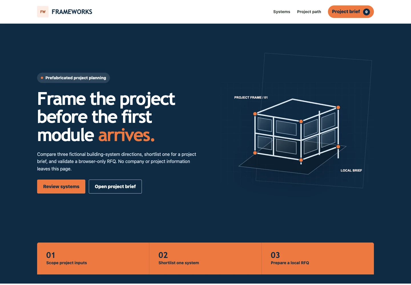
Constructify is a disciplined construction system for presenting prefabricated-building capabilities and turning early requirements into a structured project brief. A white utility header leads into a deep-navy hero, orange actions and project markers establish priority, and compact square-edged cards keep technical choices easy to compare. The complete interaction sequence is capability review, one-system shortlist, local RFQ validation, confirmation, and reset.

## Tokens — Colors

| Name | Value | Token | Role |
|------|-------|-------|------|
| Site Canvas | `#f5f7f6` | `--canvas` | Quiet neutral background for long-form project content |
| Surface White | `#ffffff` | `--surface` | Header, cards, drawer, inputs, and readable foreground panels |
| Construction Orange | `#ed783f` | `--orange` | Primary action, project markers, active rules, and sequence emphasis on navy |
| Burnt Orange | `#a84418` | `--orange-dark` | Pressed action, text accent on light surfaces, and focused fields |
| Orange Wash | `#fcece4` | `--orange-soft` | Brand-mark field and low-priority highlighted regions |
| Structural Navy | `#0f2a44` | `--navy` | Hero, process band, headings, count markers, and primary framing |
| Blueprint Navy | `#183a59` | `--navy-soft` | Illustration planes and secondary dark surfaces |
| Field Text | `#37423b` | `--text` | Main body copy on white and neutral surfaces |
| Plan Muted | `#66716b` | `--muted` | Supporting copy, criteria, and form guidance |
| Drawing Line | `#d5ded9` | `--line` | Card, field, header, and drawer dividers |
| Success | `#19714d` | `--success` | Completed local RFQ confirmation |
| Danger | `#a63a2b` | `--danger` | Invalid form feedback |

## Tokens — Typography

Use Trebuchet MS or Avenir Next for construction-led display text and Open Sans or the system UI stack for body content. Large headings use a compact line height and firm weight; technical criteria stay at a comfortable 14–16px.

### Type Scale

| Role | Family | Weight | Size | Line Height | Letter Spacing | Token |
|------|--------|--------|------|-------------|----------------|-------|
| Caption | Open Sans | 800 | 12px | 1.3 | 0.13em | `--text-caption` |
| Small body | Open Sans | 600 | 14px | 1.5 | normal | `--text-body-sm` |
| Body | Open Sans | 400 | 16px | 1.6 | normal | `--text-body` |
| Card heading | Trebuchet MS | 800 | 21px | 1.2 | -0.015em | `--text-heading-sm` |
| Section heading | Trebuchet MS | 800 | 38px | 1.08 | -0.035em | `--text-heading` |
| Display | Trebuchet MS | 800 | 62px | 1.02 | -0.045em | `--text-display` |

## Tokens — Spacing & Shapes

**Density:** structured project planning

### Spacing Scale

| Name | Value | Token |
|------|-------|-------|
| 1 | 4px | `--space-1` |
| 2 | 8px | `--space-2` |
| 3 | 12px | `--space-3` |
| 4 | 16px | `--space-4` |
| 6 | 24px | `--space-6` |
| 8 | 32px | `--space-8` |
| 12 | 48px | `--space-12` |
| 16 | 64px | `--space-16` |

### Border Radius

| Element | Value | Token |
|---------|-------|-------|
| Inputs and actions | 4px | `--radius-control` |
| Cards and panels | 6px | `--radius` |
| Badges and counts | 999px | `--radius-pill` |

### Layout

- **Page max-width:** 1180px
- **Desktop gutter:** 24px
- **Mobile gutter:** 16px
- **Hero minimum height:** 650px on wide screens and content-driven on small screens
- **Primary breakpoint:** 760px

## Components

### White Utility Header
An 82px sticky white header holds a compact building mark, direct section links, and an orange project-brief trigger with a live count. Below 760px, navigation becomes a labeled disclosure menu; Escape closes it and returns focus to the menu trigger.

### Structural Project Hero
A deep-navy two-column hero pairs a concise planning headline with an original line-built prefabricated structure. One orange phrase and two clear actions establish hierarchy; the lower orange band summarizes scope, shortlist, and RFQ preparation without using unverifiable business totals.

### Capability System Cards
Three white cards present a system code, prefabricated-building direction, use-case summary, and three project questions. Each card has one full-width Add to project brief action that immediately reveals the selected system and its project role.

### Project Path Band
A navy three-step band explains scope, shortlist, and prepare. Orange top rules and large sequence numbers provide construction-plan rhythm while pale body text keeps supporting detail readable.

### Local Project Brief and RFQ
The right-side drawer begins with zero selected systems and keeps RFQ preparation disabled. Adding a system shows its name and project role, enables the labeled form, validates company, email, and project requirements locally, and produces an explicit no-send confirmation before reset.

### Compact Dark Footer
A darker navy footer states the fictional demonstration boundary and the local-only RFQ behavior in one short row that stacks cleanly on narrow screens.

## Do's and Don'ts

### Do
- Use construction orange for primary decisions, active rules, and visible focus.
- Keep deep navy for the hero, process framing, headings, and project-brief count.
- Present one use-case summary and one Add to project brief action per system card.
- Disable RFQ preparation until a named system is visible in the project brief.
- Preserve the complete shortlist, review, validate, confirm, and reset sequence.
- Constrain modal focus with an inert background, cyclic Tab and Shift+Tab, Escape dismissal, and opener restoration; reflow every grid below 760px.

### Don't
- Don't introduce unsupported capacity, certification, price, lead-time, delivery, or warranty claims.
- Don't enable the RFQ form while the project brief is empty.
- Don't use bright orange as body copy on light surfaces or pair text and surfaces below 4.5:1 at normal sizes.
- Don't use oversized soft-corner cards, decorative gradients, or heavy animation.
- Don't hide labels, focus indicators, empty states, or validation messages.
- Don't load proprietary template assets or external font files into the blank build.

## Surfaces

| Level | Name | Value | Purpose |
|-------|------|-------|---------|
| 0 | Site Canvas | `#f5f7f6` | Neutral page ground and planning space |
| 1 | Surface White | `#ffffff` | Header, system cards, drawer, and form |
| 2 | Structural Navy | `#0f2a44` | Hero and project-path band |
| 3 | Construction Orange | `#ed783f` | Actions, sequence, and scope markers |
| 4 | Closing Navy | `#0a1d2e` | Footer and final boundary |

## Elevation

System cards are flat with a 1px drawing line and gain `0 20px 52px rgb(15 42 68 / 12%)` only on hover. The project-brief drawer uses a stronger horizontal shadow to separate it from the navy backdrop. Actions communicate state through fill and border, not floating elevation.

## Imagery

Prefer approved wide crops of modular frames, steel connections, façade panels, site logistics, and completed prefabricated structures under neutral daylight. Keep trademarks and project identifiers out of generic demonstrations. When approved photography is unavailable, use original geometric SVG structures with navy planes, orange joint markers, and thin drawing lines.

## Layout

The page follows a project-planning sequence: sticky utility header, deep-navy split hero, orange scope band, three capability cards, three-step project path, local project-brief drawer, and compact footer. Wide layouts use an 1180px centered shell. At 760px the navigation, hero, scope band, cards, process steps, and footer stack in DOM order; all actions remain at least 44px high and horizontal scrolling is prohibited.

## Agent Prompt Guide

**Quick Color Reference**
- Background: `#f5f7f6` canvas and `#ffffff` system surfaces
- Text: `#37423b` body and `#66716b` supporting copy
- Border: `#d5ded9`
- Accent on navy and action surface: `#ed783f`; light-surface text and pressed state: `#a84418`
- Structural surface: `#0f2a44`

**Example Component Prompts**
1. Create a deep-navy B2B project hero with a compact project-planning badge, a 62px white heading with one orange phrase, a solid orange action, an outlined secondary action, and an original SVG prefabricated-frame illustration.
2. Create three square-edged capability cards. Each needs a small orange system code, navy system name, concise use-case copy, three project questions, and a 48px Add to project brief action.
3. Create a right-side project-brief drawer with a dim navy backdrop. Its empty state disables RFQ preparation; its filled state shows the system name, project role, remove action, and labeled local form.
4. Create a local RFQ form with company, work email, and project-requirement fields, explicit invalid feedback, a no-send completion message, and a reset action.

## Similar Brands

- **Kingspan** — Technical building-system hierarchy and disciplined project information.
- **Modulaire Group** — Modular-space categories presented through clear business pathways.
- **Portakabin** — Project-oriented building choices paired with concise specification framing.
- **Butler Manufacturing** — Structural color, direct capability segmentation, and quote-led conversion.

## Quick Start

The implementation block is a complete standalone foundation for the blank-template test, including tokens, responsive sections, drawer states, focus treatment, and the local RFQ sequence.

### CSS Custom Properties

```css
:root {
  --canvas: #f5f7f6;
  --surface: #ffffff;
  --orange: #ed783f;
  --orange-dark: #a84418;
  --orange-soft: #fcece4;
  --navy: #0f2a44;
  --navy-soft: #183a59;
  --text: #37423b;
  --muted: #66716b;
  --line: #d5ded9;
  --success: #19714d;
  --danger: #a63a2b;
  --font-heading: 'Trebuchet MS', 'Avenir Next', ui-sans-serif, system-ui, sans-serif;
  --font-body: 'Open Sans', ui-sans-serif, system-ui, -apple-system, 'Segoe UI', sans-serif;
  --text-caption: 12px;
  --text-body-sm: 14px;
  --text-body: 16px;
  --text-heading-sm: 21px;
  --text-heading: 38px;
  --text-display: 62px;
  --space-1: 4px;
  --space-2: 8px;
  --space-3: 12px;
  --space-4: 16px;
  --space-6: 24px;
  --space-8: 32px;
  --space-12: 48px;
  --space-16: 64px;
  --layout-max: 1180px;
  --gutter: 24px;
  --radius: 6px;
  --radius-control: 4px;
  --radius-pill: 999px;
  --hero-min-height: 650px;
  --shadow-card: 0 20px 52px rgb(15 42 68 / 12%);
}

* { box-sizing: border-box; }
html { scroll-behavior: smooth; }
body { margin: 0; min-width: 320px; background: var(--canvas); color: var(--text); font: 400 var(--text-body)/1.6 var(--font-body); }
body.is-locked { overflow: hidden; }
[hidden] { display: none !important; }
img { display: block; max-width: 100%; }
button, input, textarea { font: inherit; }
button, a { -webkit-tap-highlight-color: transparent; }
a { color: inherit; }
:focus-visible { outline: 3px solid var(--orange); outline-offset: 3px; }
.skip-link { position: fixed; z-index: 200; top: var(--space-3); left: var(--space-3); padding: var(--space-2) var(--space-4); background: var(--surface); color: var(--navy); transform: translateY(-180%); }
.skip-link:focus { transform: none; }
.shell { width: min(calc(100% - (2 * var(--gutter))), var(--layout-max)); margin-inline: auto; }
.eyebrow { margin: 0 0 var(--space-3); color: var(--orange-dark); font-size: var(--text-caption); font-weight: 800; letter-spacing: .13em; text-transform: uppercase; }
.button { display: inline-flex; min-height: 48px; align-items: center; justify-content: center; gap: var(--space-3); border: 1px solid transparent; border-radius: var(--radius-control); padding: 11px 20px; background: var(--orange); color: var(--navy); font-weight: 800; text-decoration: none; cursor: pointer; }
.button:hover { background: #f27b43; }
.button:active { background: var(--orange-dark); color: var(--surface); }
.button:disabled { background: #d7dcda; color: #45514b; cursor: not-allowed; }
.button--quiet { border-color: rgb(255 255 255 / 72%); background: transparent; color: var(--surface); }
.button--quiet:hover { border-color: var(--orange); background: rgb(255 255 255 / 8%); }

.site-header { position: sticky; z-index: 40; top: 0; border-bottom: 1px solid var(--line); background: rgb(255 255 255 / 96%); backdrop-filter: blur(12px); }
.header-row { display: flex; min-height: 82px; align-items: center; justify-content: space-between; gap: var(--space-6); }
.brand { display: inline-flex; align-items: center; gap: 11px; color: var(--navy); font: 800 22px/1 var(--font-heading); text-decoration: none; }
.brand-mark { display: grid; width: 40px; height: 40px; place-items: center; border-radius: var(--radius-control); background: var(--orange-soft); color: var(--orange-dark); font-size: 13px; letter-spacing: -.04em; }
.nav { display: flex; align-items: center; gap: var(--space-6); }
.nav a { color: var(--text); font-size: var(--text-body-sm); font-weight: 700; text-decoration: none; }
.nav a:hover { color: var(--orange-dark); }
.brief-trigger, .menu-trigger, .icon-button { border: 0; background: transparent; color: var(--navy); font-weight: 800; cursor: pointer; }
.brief-trigger { min-height: 44px; border-radius: var(--radius-pill); padding: 9px 14px; background: var(--orange); }
.brief-count { display: inline-grid; min-width: 24px; height: 24px; margin-left: 7px; place-items: center; border-radius: var(--radius-pill); background: var(--navy); color: var(--surface); font-size: 12px; }
.menu-trigger { display: none; border: 1px solid var(--line); border-radius: var(--radius-control); padding: 8px 11px; }

.hero { min-height: var(--hero-min-height); overflow: hidden; background: var(--navy); color: var(--surface); }
.hero-shell { display: grid; min-height: 560px; grid-template-columns: 1.02fr .98fr; gap: clamp(38px, 6vw, 92px); align-items: center; padding-block: var(--space-16); }
.hero-badge { display: inline-flex; align-items: center; gap: var(--space-2); margin-bottom: var(--space-6); border-radius: var(--radius-pill); padding: 7px 13px; background: rgb(255 255 255 / 12%); color: #f7f9fb; font-size: var(--text-body-sm); font-weight: 750; }
.hero-badge::before { content: ''; width: 8px; height: 8px; border-radius: 50%; background: var(--orange); }
.hero h1 { max-width: 740px; margin: 0; font: 800 clamp(46px, 6vw, var(--text-display))/1.02 var(--font-heading); letter-spacing: -.045em; }
.hero h1 span { color: var(--orange); }
.hero-copy > p { max-width: 630px; margin: var(--space-6) 0; color: #d6e0e8; }
.hero-actions { display: flex; flex-wrap: wrap; gap: var(--space-3); }
.hero-art { position: relative; min-height: 430px; }
.hero-art::before { content: ''; position: absolute; inset: 8% 4% auto auto; width: 70%; height: 70%; border: 1px solid rgb(255 255 255 / 15%); transform: rotate(4deg); }
.hero-art img { position: relative; width: 100%; min-height: 430px; object-fit: contain; filter: drop-shadow(0 28px 40px rgb(0 0 0 / 28%)); }
.stats-band { display: grid; grid-template-columns: repeat(3, 1fr); margin-bottom: var(--space-8); border-radius: var(--radius) var(--radius) 0 0; background: var(--orange); color: var(--navy); }
.stat { display: grid; min-height: 112px; align-content: center; gap: 2px; border-right: 1px solid rgb(15 42 68 / 20%); padding: var(--space-4) var(--space-8); }
.stat:last-child { border-right: 0; }
.stat strong { font: 800 28px/1 var(--font-heading); }
.stat span { font-size: var(--text-body-sm); font-weight: 700; }

.section { padding-block: 96px; }
.section--surface { background: var(--surface); }
.section-heading { display: grid; grid-template-columns: .65fr 1.35fr; gap: var(--space-8); margin-bottom: var(--space-12); }
.section-heading h2 { max-width: 720px; margin: 0; color: var(--navy); font: 800 clamp(34px, 5vw, 52px)/1.06 var(--font-heading); letter-spacing: -.04em; }
.section-heading p:last-child { max-width: 600px; margin: var(--space-4) 0 0; color: var(--muted); }
.system-grid { display: grid; grid-template-columns: repeat(3, 1fr); gap: var(--space-4); }
.system-card { display: flex; min-height: 390px; flex-direction: column; border: 1px solid var(--line); border-radius: var(--radius); padding: var(--space-6); background: var(--surface); }
.system-card:hover { border-color: var(--orange); box-shadow: var(--shadow-card); }
.system-code { display: flex; align-items: center; justify-content: space-between; color: var(--orange-dark); font-size: var(--text-caption); font-weight: 800; letter-spacing: .11em; }
.system-code::after { content: ''; width: 44px; height: 2px; background: var(--orange); }
.system-card h3 { margin: var(--space-6) 0 var(--space-2); color: var(--navy); font: 800 var(--text-heading-sm)/1.2 var(--font-heading); }
.system-card p { margin: 0; color: var(--muted); }
.decision-list { display: grid; gap: var(--space-2); margin: auto 0 var(--space-4); padding: var(--space-8) 0 0; color: var(--muted); font-size: var(--text-body-sm); }
.decision-list span::before { content: '—'; margin-right: var(--space-2); color: var(--orange-dark); }
.system-card .button { width: 100%; }

.process { background: var(--navy); color: var(--surface); }
.process .eyebrow { color: var(--orange); }
.process .section-heading h2 { color: var(--surface); }
.process .section-heading p:last-child { color: #cad6df; }
.process-grid { display: grid; grid-template-columns: repeat(3, 1fr); gap: var(--space-6); }
.process-card { border-top: 2px solid var(--orange); padding: var(--space-6) 0; }
.process-card b { color: var(--orange); font: 800 30px/1 var(--font-heading); }
.process-card h3 { margin: var(--space-4) 0 var(--space-2); font: 800 var(--text-heading-sm)/1.2 var(--font-heading); }
.process-card p { margin: 0; color: #cad6df; }

.brief-drawer { position: fixed; z-index: 90; top: 0; right: 0; width: min(480px, 100%); height: 100dvh; overflow-y: auto; padding: var(--space-8); background: var(--surface); box-shadow: -20px 0 60px rgb(15 42 68 / 28%); }
.brief-backdrop { position: fixed; z-index: 80; inset: 0; background: rgb(15 42 68 / 72%); }
.drawer-head { display: flex; align-items: center; justify-content: space-between; }
.drawer-head h2 { margin: 0; color: var(--navy); font: 800 var(--text-heading)/1.1 var(--font-heading); }
.icon-button { display: grid; width: 42px; height: 42px; place-items: center; border: 1px solid var(--line); border-radius: var(--radius-control); font-size: 22px; }
.brief-empty { margin: var(--space-12) 0; color: var(--muted); }
.brief-line { display: grid; grid-template-columns: 1fr auto; gap: var(--space-2); border-block: 1px solid var(--line); padding-block: var(--space-6); }
.brief-line p { grid-column: 1 / -1; margin: 0; color: var(--muted); }
.brief-line strong { color: var(--navy); font: 800 var(--text-heading-sm)/1.2 var(--font-heading); }
.remove-item { grid-column: 1 / -1; width: fit-content; border: 0; padding: 0; background: transparent; color: var(--orange-dark); font-weight: 800; cursor: pointer; }
.brief-summary { display: flex; justify-content: space-between; margin: var(--space-8) 0; color: var(--navy); font-size: var(--text-heading-sm); }
.brief-drawer > .button { width: 100%; }
.rfq-form { display: grid; gap: var(--space-4); margin-top: var(--space-8); border-top: 1px solid var(--line); padding-top: var(--space-8); }
.rfq-form label { display: grid; gap: var(--space-2); color: var(--navy); font-size: var(--text-body-sm); font-weight: 800; }
.rfq-form input, .rfq-form textarea { min-height: 46px; border: 1px solid var(--line); border-radius: var(--radius-control); padding: 10px 12px; background: var(--surface); color: var(--text); font: inherit; }
.rfq-form input:focus, .rfq-form textarea:focus { border-color: var(--orange-dark); }
.rfq-form textarea { min-height: 112px; resize: vertical; }
.rfq-status { min-height: 25px; margin: 0; color: var(--success); font-weight: 800; }
.rfq-status.is-error { color: var(--danger); }
.rfq-note { color: var(--muted); font-size: var(--text-caption); }

.site-footer { padding-block: var(--space-8); background: #0a1d2e; color: var(--surface); }
.footer-row { display: flex; justify-content: space-between; gap: var(--space-6); font-size: var(--text-body-sm); }

@media (max-width: 760px) {
  :root { --gutter: 16px; --hero-min-height: 0px; }
  .header-row { min-height: 70px; }
  .brand { font-size: 19px; }
  .brand-mark { width: 36px; height: 36px; }
  .menu-trigger { display: inline-flex; }
  .nav { position: absolute; top: 70px; right: 0; left: 0; align-items: stretch; flex-direction: column; border-bottom: 1px solid var(--line); padding: var(--space-6) var(--gutter); background: var(--surface); }
  .nav:not(.is-open) { display: none; }
  .brief-trigger { text-align: left; }
  .hero-shell { min-height: 0; grid-template-columns: 1fr; gap: var(--space-8); padding-block: var(--space-12); }
  .hero h1 { font-size: 43px; }
  .hero-art { min-height: 260px; }
  .hero-art img { min-height: 260px; }
  .stats-band { grid-template-columns: 1fr; margin-bottom: 0; border-radius: 0; }
  .stat { min-height: 86px; border-right: 0; border-bottom: 1px solid rgb(15 42 68 / 20%); padding-inline: var(--gutter); }
  .stat:last-child { border-bottom: 0; }
  .section { padding-block: var(--space-16); }
  .section-heading, .system-grid, .process-grid { grid-template-columns: 1fr; }
  .section-heading { gap: var(--space-3); }
  .system-card { min-height: 330px; }
  .brief-line { grid-template-columns: 1fr; }
  .footer-row { flex-direction: column; }
}

@media (prefers-reduced-motion: reduce) {
  html { scroll-behavior: auto; }
  *, *::before, *::after { scroll-behavior: auto !important; transition-duration: .01ms !important; animation-duration: .01ms !important; }
}
```

The Tailwind block exposes the same visual variables without duplicating component behavior.

### Tailwind v4

```css
@theme {
  --color-canvas: #f5f7f6;
  --color-surface: #ffffff;
  --color-orange: #ed783f;
  --color-orange-dark: #a84418;
  --color-orange-soft: #fcece4;
  --color-navy: #0f2a44;
  --color-navy-soft: #183a59;
  --color-text: #37423b;
  --color-muted: #66716b;
  --color-line: #d5ded9;
  --color-success: #19714d;
  --color-danger: #a63a2b;
  --font-heading: 'Trebuchet MS', 'Avenir Next', ui-sans-serif, system-ui, sans-serif;
  --font-body: 'Open Sans', ui-sans-serif, system-ui, -apple-system, 'Segoe UI', sans-serif;
  --text-caption: 12px;
  --text-body-sm: 14px;
  --text-body: 16px;
  --text-heading-sm: 21px;
  --text-heading: 38px;
  --text-display: 62px;
  --spacing-1: 4px;
  --spacing-2: 8px;
  --spacing-3: 12px;
  --spacing-4: 16px;
  --spacing-6: 24px;
  --spacing-8: 32px;
  --spacing-12: 48px;
  --spacing-16: 64px;
  --radius-control: 4px;
  --radius-card: 6px;
  --radius-pill: 999px;
  --shadow-card: 0 20px 52px rgb(15 42 68 / 12%);
}
```