# Nivora — Curated Commerce Style Reference
> An editorial B2C storefront with a complete local bag and checkout-preparation journey.

**Theme:** light

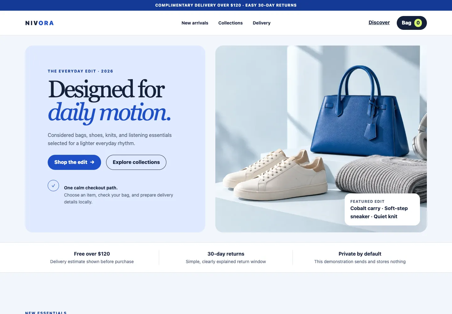
Nivora balances a quiet ice-blue canvas with confident cobalt actions, warm product photography, and restrained lime highlights. The system is built for fast consumer discovery: a clear hero, benefit strip, focused three-product grid, curated collection story, live shopping bag, and an accessible checkout-preparation form. Commerce interactions are immediate but calm, with product selection, quantity, validation, confirmation, and reset all completed locally.

## Tokens — Colors

| Name | Value | Token | Role |
|------|-------|-------|------|
| Ice Canvas | `#f3f6fb` | `--canvas` | Page background and low-emphasis form surfaces |
| Pure Surface | `#ffffff` | `--surface` | Header, product cards, bag, and form panels |
| Commerce Blue | `#1f4fc7` | `--blue` | Primary actions, selected states, and focus rings |
| Deep Blue | `#153a96` | `--blue-deep` | Announcement bar, footer, and pressed actions |
| Ink | `#14203a` | `--ink` | Main copy, navigation, and dark buttons |
| Muted Slate | `#526078` | `--muted` | Supporting text, metadata, and descriptions |
| Divider | `#dce2ee` | `--line` | Card edges, field borders, and section rules |
| Soft Blue | `#dfe9ff` | `--soft-blue` | Hero copy panel and calm promotional areas |
| Citrus Lime | `#d8f56d` | `--lime` | Bag counts, selected feedback, and small highlights |
| Error | `#b3261e` | `--danger` | Invalid field feedback |
| Success | `#14745b` | `--success` | Completed local checkout-preparation status |

## Tokens — Typography

Georgia supplies the editorial display voice while the native system sans stack handles navigation, product facts, prices, controls, and forms. The contrast gives the store a fashion-led point of view without loading external fonts.

### Type Scale

| Role | Family | Weight | Size | Line Height | Letter Spacing | Token |
|------|--------|--------|------|-------------|----------------|-------|
| Caption | Inter | 800 | 12px | 1.3 | 0.14em | `--text-caption` |
| Small body | Inter | 600 | 14px | 1.5 | normal | `--text-body-sm` |
| Body | Inter | 400 | 16px | 1.6 | normal | `--text-body` |
| Product heading | Georgia | 500 | 20px | 1.25 | -0.02em | `--text-heading-sm` |
| Section heading | Georgia | 500 | 44px | 1.02 | -0.05em | `--text-heading` |
| Display | Georgia | 500 | 76px | 0.96 | -0.065em | `--text-display` |

## Tokens — Spacing & Shapes

**Density:** relaxed editorial commerce

### Spacing Scale

| Name | Value | Token |
|------|-------|-------|
| 1 | 4px | `--space-1` |
| 2 | 8px | `--space-2` |
| 3 | 12px | `--space-3` |
| 4 | 16px | `--space-4` |
| 5 | 20px | `--space-5` |
| 6 | 24px | `--space-6` |
| 8 | 32px | `--space-8` |
| 10 | 40px | `--space-10` |
| 12 | 48px | `--space-12` |
| 16 | 64px | `--space-16` |

### Border Radius

| Element | Value | Token |
|---------|-------|-------|
| Inputs and compact controls | 10px | `--radius-sm` |
| Cards, panels, and overlays | 18px | `--radius` |
| Buttons and status counts | 999px | `--radius-pill` |

### Layout

- **Page max-width:** 1280px
- **Desktop gutter:** 32px
- **Tablet gutter:** 20px
- **Mobile gutter:** 14px
- **Hero minimum height:** 620px on wide screens
- **Primary breakpoints:** 860px and 600px

## Components

### Announcement and Header
A 34px deep-blue announcement establishes the service promise. The 78px white sticky header uses a centered navigation, compact wordmark, and dark bag trigger with a lime count. At 860px, navigation becomes a labeled menu disclosure; Escape closes it and restores focus.

### Split Editorial Hero
The first screen pairs a soft-blue copy panel with an original studio still life. The headline uses a compact Georgia rhythm, one cobalt italic phrase, two rounded actions, and a small benefit note. The image crop keeps the products on the right and protects negative space.

### Benefit Strip
Three equal messages describe delivery, returns, and local checkout preparation. Thin dividers keep the strip structured on desktop; on mobile the messages stack into a compact vertical sequence.

### Product Cards
Three cards use one licensed or original hero asset with deliberate crops, then pair product name, price, a short material note, and one full-width Add to bag action. Selection changes the action to a lime confirmation state and opens a usable bag path.

### Curated Collection Band
A deep-ink story band combines an editorial heading with two oversized lime and soft-blue collection tiles. It gives the long page a decisive tonal break without introducing gradients or decorative effects.

### Shopping Bag Drawer
The bag opens from the right above a dimmed backdrop. Its empty state disables checkout preparation; its filled state includes a product thumbnail, quantity controls, computed subtotal, and one clear continuation action. While open it traps Tab and Shift+Tab, makes the page inaccessible to assistive technology, and keeps checkout isolated until that inner layer is opened. Escape and the close control return focus to the opening control.

### Checkout Preparation Modal
The local form collects name, email, region, postal code, and agreement. Visible labels, inline errors, and first-error focus support completion. It is the active isolated layer above the bag, with a complete Tab and Shift+Tab loop. Escape returns focus to the bag continuation control; a second Escape returns focus to the original bag opener. A successful submission confirms that the plan is ready and that nothing was sent or stored; reset returns every field and status to the starting state.

### Footer
A deep-blue footer repeats the fictional-store and local-only boundary, then groups shop and help links into compact columns that remain easy to scan on small screens.

## Do's and Don'ts

### Do
- Use cobalt for the primary consumer decision, focus ring, and selected state.
- Keep product names, prices, and Add to bag actions together inside each card.
- Preserve the complete local path from product selection through bag, quantity, validation, confirmation, and reset.
- Use Georgia only for editorial headings and product names; keep controls in the system sans stack.
- Reflow two-column layouts and the product grid into one column at the documented breakpoints.
- Return focus to the opening control whenever a drawer, menu, or modal closes.

### Don't
- Don't send, store, or persist checkout-preparation values.
- Don't enable checkout preparation while the bag is empty.
- Don't add ratings, scarcity, reviews, inventory, or delivery claims without real data.
- Don't use external fonts, remote scripts, remote form actions, or off-site checkout links.
- Don't hide field labels, keyboard focus, error text, or success confirmation.
- Don't introduce gradients, glassmorphism, or more than one major accent color.

## Surfaces

| Level | Name | Value | Purpose |
|-------|------|-------|---------|
| 0 | Ice Canvas | `#f3f6fb` | Page background and quiet spacing |
| 1 | Pure Surface | `#ffffff` | Product cards, header, bag, and form |
| 2 | Soft Blue Panel | `#dfe9ff` | Hero copy and editorial emphasis |
| 3 | Ink Band | `#14203a` | Collection story and modal backdrop relationship |
| 4 | Deep Blue Closure | `#153a96` | Announcement and footer |

## Elevation

Product cards are flat by default with a 1px divider and gain `0 18px 50px rgb(20 32 58 / 10%)` on hover. The bag uses a directional shadow to read as a drawer, while the modal uses a centered ambient shadow. Buttons remain flat and communicate state through color.

## Imagery

Use original or licensed studio still lifes with pale blue surroundings, matte accessories, and a single cobalt object. Keep brands and printed marks out of frame. Favor 3:2 or 4:3 crops, gentle natural shadows, and enough quiet space for responsive cropping. Product cards may reuse one campaign image only when each crop clearly isolates a different item; production catalogs should provide a dedicated image per product.

## Layout

The page follows a consumer journey: service announcement, sticky header, two-column hero, three benefit messages, three-product discovery grid, dark collection story, checkout-preparation explainer, and footer. The shopping bag and checkout form sit above the page as connected overlays. At 860px the header and major two-column areas stack; at 600px cards, collections, form fields, and actions become single-column with 44–48px minimum controls and no page-level horizontal scrolling.

## Agent Prompt Guide

**Quick Color Reference**
- Background: `#f3f6fb` with `#ffffff` cards
- Text: `#14203a`; supporting text `#526078`
- Border: `#dce2ee`
- Primary action: `#1f4fc7`; pressed action `#153a96`
- Highlight: `#d8f56d`; editorial panel `#dfe9ff`

**Example Component Prompts**
1. Create a split B2C hero on an ice-blue page: a rounded soft-blue copy panel with a 76px Georgia heading, cobalt primary pill, outlined secondary pill, and a right-hand original studio product image with a small white information card.
2. Create a three-card product grid. Each white 18px-radius card needs an image crop, Georgia product name, cobalt price, one-line material note, and a full-width 48px cobalt Add to bag button with a lime selected state.
3. Create an accessible right-side shopping bag with an empty disabled state, product thumbnail, quantity controls, computed subtotal, local checkout-preparation action, complete Tab and Shift+Tab containment, background assistive-technology isolation, Escape support, and focus restoration.
4. Create a checkout-preparation modal with visible labels, inline errors, first-invalid-field focus, a terms checkbox, local success text, a reset action, complete Tab and Shift+Tab containment, and isolation of both page and bag. Do not set a form action or send any request.

## Similar Brands

- **Everlane** — Restrained product storytelling, clean shopping decisions, and direct material language.
- **COS** — Editorial typography, generous spacing, and image-led category discovery.
- **Baggu** — Confident color blocks, approachable product cards, and compact consumer navigation.
- **Aesop** — Calm surfaces, precise hierarchy, and disciplined information density.

## Quick Start

The standalone block includes tokens, full page components, overlay states, accessible focus treatment, and responsive rules for the blank-template implementation.

### CSS Custom Properties

```css
:root {
  --canvas: #f3f6fb;
  --surface: #ffffff;
  --blue: #1f4fc7;
  --blue-deep: #153a96;
  --ink: #14203a;
  --muted: #526078;
  --line: #dce2ee;
  --soft-blue: #dfe9ff;
  --lime: #d8f56d;
  --danger: #b3261e;
  --success: #14745b;
  --font-display: Georgia, "Times New Roman", serif;
  --font-body: Inter, ui-sans-serif, system-ui, -apple-system, BlinkMacSystemFont, "Segoe UI", sans-serif;
  --text-caption: 0.75rem;
  --text-body-sm: 0.875rem;
  --text-body: 1rem;
  --text-heading-sm: 1.25rem;
  --text-heading: 2.75rem;
  --text-display: 4.75rem;
  --space-1: 0.25rem;
  --space-2: 0.5rem;
  --space-3: 0.75rem;
  --space-4: 1rem;
  --space-5: 1.25rem;
  --space-6: 1.5rem;
  --space-8: 2rem;
  --space-10: 2.5rem;
  --space-12: 3rem;
  --space-16: 4rem;
  --layout-max: 1280px;
  --gutter: 32px;
  --radius: 18px;
  --radius-sm: 10px;
  --radius-pill: 999px;
  --hero-min-height: 620px;
  --shadow-card: 0 18px 50px rgb(20 32 58 / 10%);
  --shadow-drawer: -24px 0 72px rgb(20 32 58 / 20%);
}

* { box-sizing: border-box; }
html { scroll-behavior: smooth; }
body {
  margin: 0;
  color: var(--ink);
  background: var(--canvas);
  font-family: var(--font-body);
  font-size: var(--text-body);
  line-height: 1.6;
}
body.is-locked { overflow: hidden; }
button, input, select { font: inherit; }
button, a { -webkit-tap-highlight-color: transparent; }
button { color: inherit; }
a { color: inherit; }
img { display: block; max-width: 100%; }
[hidden] { display: none !important; }

.skip-link {
  position: fixed;
  z-index: 100;
  top: 8px;
  left: 8px;
  padding: 10px 14px;
  color: var(--surface);
  background: var(--blue-deep);
  border-radius: var(--radius-sm);
  transform: translateY(-160%);
}
.skip-link:focus { transform: translateY(0); }
:focus-visible { outline: 3px solid var(--blue); outline-offset: 3px; }
.shell { width: min(calc(100% - (var(--gutter) * 2)), var(--layout-max)); margin-inline: auto; }
.eyebrow {
  margin: 0 0 var(--space-3);
  color: var(--blue-deep);
  font-size: var(--text-caption);
  font-weight: 800;
  letter-spacing: 0.14em;
  text-transform: uppercase;
}

.announcement {
  min-height: 34px;
  display: grid;
  place-items: center;
  padding: 6px var(--space-4);
  color: var(--surface);
  background: var(--blue-deep);
  font-size: var(--text-caption);
  font-weight: 750;
  letter-spacing: 0.08em;
  text-align: center;
  text-transform: uppercase;
}
.announcement p { margin: 0; }
.site-header {
  position: sticky;
  z-index: 30;
  top: 0;
  background: rgb(255 255 255 / 96%);
  border-bottom: 1px solid var(--line);
  backdrop-filter: blur(12px);
}
.header-inner {
  min-height: 78px;
  display: grid;
  grid-template-columns: 1fr auto 1fr;
  align-items: center;
  gap: var(--space-6);
}
.brand {
  justify-self: start;
  color: var(--ink);
  font-size: 1.18rem;
  font-weight: 900;
  letter-spacing: 0.16em;
  text-decoration: none;
}
.brand span { color: var(--blue); }
.desktop-nav { display: flex; gap: var(--space-8); }
.desktop-nav a {
  position: relative;
  font-size: var(--text-body-sm);
  font-weight: 700;
  text-decoration: none;
}
.desktop-nav a::after {
  position: absolute;
  right: 0;
  bottom: -8px;
  left: 0;
  height: 2px;
  content: "";
  background: var(--blue);
  transform: scaleX(0);
  transition: transform 180ms ease;
}
.desktop-nav a:hover::after, .desktop-nav a:focus-visible::after { transform: scaleX(1); }
.header-actions { justify-self: end; display: flex; align-items: center; gap: var(--space-3); }
.quiet-button, .bag-trigger, .menu-trigger, .close-button, .quantity-button {
  min-height: 44px;
  border: 0;
  background: transparent;
  cursor: pointer;
}
.quiet-button { padding: 8px 10px; font-weight: 700; }
.bag-trigger {
  padding: 8px 16px;
  border-radius: var(--radius-pill);
  color: var(--surface);
  background: var(--ink);
  font-weight: 800;
}
.bag-trigger span {
  min-width: 24px;
  display: inline-grid;
  place-items: center;
  margin-left: 6px;
  color: var(--ink);
  background: var(--lime);
  border-radius: var(--radius-pill);
}
.menu-trigger { display: none; padding: 8px; font-weight: 800; }
.mobile-nav {
  padding: 0 var(--gutter) var(--space-6);
  border-top: 1px solid var(--line);
  background: var(--surface);
}
.mobile-nav a {
  display: block;
  padding: 15px 0;
  border-bottom: 1px solid var(--line);
  font-weight: 750;
  text-decoration: none;
}

.hero {
  min-height: var(--hero-min-height);
  display: grid;
  grid-template-columns: minmax(0, 0.92fr) minmax(0, 1.08fr);
  align-items: stretch;
  gap: var(--space-8);
  padding-block: var(--space-8);
}
.hero-copy {
  display: flex;
  flex-direction: column;
  justify-content: center;
  padding: clamp(32px, 5vw, 76px);
  background: var(--soft-blue);
  border-radius: calc(var(--radius) * 1.35);
}
.hero h1 {
  max-width: 9ch;
  margin: 0;
  font-family: var(--font-display);
  font-size: clamp(3.5rem, 6.2vw, var(--text-display));
  font-weight: 500;
  letter-spacing: -0.065em;
  line-height: 0.96;
}
.hero h1 em { color: var(--blue); font-weight: inherit; }
.hero-copy > p:not(.eyebrow) { max-width: 45ch; margin: var(--space-6) 0; color: var(--muted); }
.action-row { display: flex; flex-wrap: wrap; align-items: center; gap: var(--space-4); }
.button {
  min-height: 48px;
  display: inline-flex;
  align-items: center;
  justify-content: center;
  gap: var(--space-2);
  padding: 10px 20px;
  border: 1px solid transparent;
  border-radius: var(--radius-pill);
  font-weight: 800;
  text-decoration: none;
  cursor: pointer;
}
.button-primary { color: var(--surface); background: var(--blue); }
.button-primary:hover { background: var(--blue-deep); }
.button-secondary { border-color: var(--ink); color: var(--ink); background: transparent; }
.button-secondary:hover { background: var(--surface); }
.button:disabled { cursor: not-allowed; opacity: 0.5; }
.hero-note { display: flex; gap: var(--space-4); margin-top: var(--space-8); color: var(--muted); font-size: var(--text-body-sm); }
.hero-note strong { color: var(--ink); }
.hero-note span { width: 36px; height: 36px; flex: 0 0 auto; display: grid; place-items: center; border: 1px solid var(--blue); border-radius: 50%; color: var(--blue); }
.hero-media { position: relative; min-height: 556px; overflow: hidden; border-radius: calc(var(--radius) * 1.35); background: var(--surface); }
.hero-media img { width: 100%; height: 100%; object-fit: cover; object-position: 57% center; }
.hero-tag {
  position: absolute;
  right: 22px;
  bottom: 22px;
  max-width: 240px;
  padding: 16px 18px;
  background: var(--surface);
  border-radius: var(--radius);
  box-shadow: var(--shadow-card);
}
.hero-tag p, .hero-tag strong { margin: 0; display: block; }
.hero-tag p { color: var(--muted); font-size: var(--text-caption); font-weight: 800; letter-spacing: 0.08em; text-transform: uppercase; }

.feature-strip { border-block: 1px solid var(--line); background: var(--surface); }
.feature-grid { min-height: 94px; display: grid; grid-template-columns: repeat(3, 1fr); align-items: center; }
.feature-grid p { margin: 0; padding: 0 var(--space-8); border-right: 1px solid var(--line); color: var(--muted); font-size: var(--text-body-sm); text-align: center; }
.feature-grid p:last-child { border-right: 0; }
.feature-grid strong { display: block; color: var(--ink); font-size: var(--text-body); }

.section { padding-block: clamp(72px, 9vw, 120px); }
.section-heading { display: flex; align-items: end; justify-content: space-between; gap: var(--space-8); margin-bottom: var(--space-10); }
.section-heading h2, .checkout-copy h2 {
  max-width: 12ch;
  margin: 0;
  font-family: var(--font-display);
  font-size: clamp(2.5rem, 5vw, var(--text-heading));
  font-weight: 500;
  letter-spacing: -0.05em;
  line-height: 1.02;
}
.section-heading > p { max-width: 43ch; margin: 0; color: var(--muted); }
.product-grid { display: grid; grid-template-columns: repeat(3, minmax(0, 1fr)); gap: var(--space-5); }
.product-card {
  overflow: hidden;
  background: var(--surface);
  border: 1px solid var(--line);
  border-radius: var(--radius);
  transition: transform 180ms ease, box-shadow 180ms ease;
}
.product-card:hover { transform: translateY(-4px); box-shadow: var(--shadow-card); }
.product-image { height: 330px; overflow: hidden; background: var(--soft-blue); }
.product-image img { width: 100%; height: 100%; object-fit: cover; transform: scale(1.34); }
.product-one img { object-position: 15% 54%; }
.product-two img { object-position: 55% 50%; }
.product-three img { object-position: 92% 52%; }
.product-content { padding: var(--space-5); }
.product-topline { display: flex; justify-content: space-between; gap: var(--space-4); }
.product-topline h3 { margin: 0; font-family: var(--font-display); font-size: var(--text-heading-sm); }
.product-topline strong { color: var(--blue-deep); }
.product-content > p { min-height: 52px; margin: 8px 0 var(--space-5); color: var(--muted); font-size: var(--text-body-sm); }
.add-button { width: 100%; }
.add-button[data-added="true"] { color: var(--ink); background: var(--lime); }

.collection-band { color: var(--surface); background: var(--ink); }
.collection-grid { display: grid; grid-template-columns: 0.9fr 1.1fr; align-items: center; gap: clamp(40px, 7vw, 100px); }
.collection-grid h2 { max-width: 12ch; margin: 0; font-family: var(--font-display); font-size: clamp(2.7rem, 5vw, 4.8rem); font-weight: 500; line-height: 1; letter-spacing: -0.055em; }
.collection-grid p { color: #c7cfdf; }
.collection-cards { display: grid; grid-template-columns: repeat(2, 1fr); gap: var(--space-4); }
.collection-card { min-height: 190px; display: flex; flex-direction: column; justify-content: end; padding: var(--space-6); color: var(--ink); background: var(--lime); border-radius: var(--radius); }
.collection-card:last-child { background: var(--soft-blue); }
.collection-card span { font-size: var(--text-caption); font-weight: 850; letter-spacing: 0.12em; text-transform: uppercase; }
.collection-card strong { margin-top: auto; font-family: var(--font-display); font-size: 1.8rem; }

.checkout-preview { display: grid; grid-template-columns: 0.8fr 1.2fr; gap: var(--space-8); align-items: start; }
.checkout-copy { position: sticky; top: 126px; }
.checkout-copy p { max-width: 44ch; color: var(--muted); }
.checkout-card { padding: clamp(24px, 4vw, 48px); background: var(--surface); border: 1px solid var(--line); border-radius: var(--radius); }
.checkout-steps { display: flex; gap: var(--space-3); margin-bottom: var(--space-8); }
.checkout-steps span { flex: 1; padding: 8px 10px; color: var(--muted); background: var(--canvas); border-radius: var(--radius-pill); font-size: var(--text-caption); font-weight: 800; text-align: center; }
.checkout-steps span:first-child { color: var(--surface); background: var(--blue); }
.checkout-card h3 { margin: 0 0 var(--space-6); font-family: var(--font-display); font-size: 1.8rem; }
.checkout-card dl { margin: 0; }
.checkout-card dl div { display: flex; justify-content: space-between; gap: var(--space-4); padding: 14px 0; border-top: 1px solid var(--line); }
.checkout-card dt { color: var(--muted); }
.checkout-card dd { margin: 0; font-weight: 750; }

.site-footer { padding-block: var(--space-12); color: #c7cfdf; background: var(--blue-deep); }
.footer-grid { display: grid; grid-template-columns: 1.5fr repeat(2, 1fr); gap: var(--space-8); }
.footer-grid h2 { margin: 0 0 var(--space-4); color: var(--surface); font-size: var(--text-body); }
.footer-grid a { display: block; margin: 6px 0; }
.footer-brand { color: var(--surface); }
.footer-brand span { color: #ffffff; }
.footer-note { max-width: 48ch; font-size: var(--text-body-sm); }

.backdrop {
  position: fixed;
  z-index: 50;
  inset: 0;
  background: rgb(20 32 58 / 54%);
}
.drawer {
  position: fixed;
  z-index: 60;
  top: 0;
  right: 0;
  width: min(100%, 470px);
  height: 100dvh;
  display: flex;
  flex-direction: column;
  padding: var(--space-6);
  background: var(--surface);
  box-shadow: var(--shadow-drawer);
}
.drawer-header { display: flex; align-items: center; justify-content: space-between; gap: var(--space-4); padding-bottom: var(--space-5); border-bottom: 1px solid var(--line); }
.drawer-header h2 { margin: 0; font-family: var(--font-display); font-size: 2rem; }
.close-button { width: 44px; display: grid; place-items: center; border: 1px solid var(--line); border-radius: 50%; font-size: 1.5rem; }
.drawer-body { flex: 1; overflow: auto; padding-block: var(--space-6); }
.empty-bag { padding: var(--space-8); color: var(--muted); background: var(--canvas); border-radius: var(--radius); text-align: center; }
.bag-item { display: grid; grid-template-columns: 84px 1fr; gap: var(--space-4); padding-bottom: var(--space-5); border-bottom: 1px solid var(--line); }
.bag-item img { width: 84px; height: 94px; object-fit: cover; object-position: 20% 50%; border-radius: var(--radius-sm); }
.bag-item h3, .bag-item p { margin: 0; }
.bag-item p { color: var(--muted); font-size: var(--text-body-sm); }
.quantity { display: inline-flex; align-items: center; gap: var(--space-2); margin-top: var(--space-3); border: 1px solid var(--line); border-radius: var(--radius-pill); }
.quantity-button { min-width: 40px; }
.drawer-footer { padding-top: var(--space-5); border-top: 1px solid var(--line); }
.subtotal { display: flex; justify-content: space-between; margin-bottom: var(--space-4); font-weight: 800; }
.drawer-footer .button { width: 100%; }

.modal {
  position: fixed;
  z-index: 70;
  top: 50%;
  left: 50%;
  width: min(calc(100% - 32px), 620px);
  max-height: calc(100dvh - 32px);
  overflow: auto;
  padding: clamp(24px, 4vw, 40px);
  background: var(--surface);
  border-radius: var(--radius);
  box-shadow: 0 28px 90px rgb(20 32 58 / 25%);
  transform: translate(-50%, -50%);
}
.modal-header { display: flex; align-items: start; justify-content: space-between; gap: var(--space-5); }
.modal-header h2 { margin: 0; font-family: var(--font-display); font-size: 2.25rem; }
.modal-header p { margin: 6px 0 0; color: var(--muted); }
.form-grid { display: grid; grid-template-columns: repeat(2, minmax(0, 1fr)); gap: var(--space-4); margin-top: var(--space-6); }
.field { display: grid; gap: 6px; }
.field-full { grid-column: 1 / -1; }
.field label { font-size: var(--text-body-sm); font-weight: 750; }
.field input, .field select {
  width: 100%;
  min-height: 48px;
  padding: 10px 12px;
  border: 1px solid var(--line);
  border-radius: var(--radius-sm);
  color: var(--ink);
  background: var(--surface);
}
.field input[aria-invalid="true"], .field select[aria-invalid="true"] { border-color: var(--danger); }
.field-error { min-height: 20px; margin: 0; color: var(--danger); font-size: var(--text-caption); }
.terms { grid-column: 1 / -1; display: flex; align-items: start; gap: var(--space-3); padding: 12px; background: var(--canvas); border-radius: var(--radius-sm); }
.terms input { width: 20px; height: 20px; margin-top: 2px; }
.modal-actions { grid-column: 1 / -1; display: flex; flex-wrap: wrap; gap: var(--space-3); }
.form-status { grid-column: 1 / -1; min-height: 24px; margin: 0; font-weight: 750; }
.form-status.is-success { color: var(--success); }
.form-status.is-error { color: var(--danger); }
.toast {
  position: fixed;
  z-index: 80;
  right: 20px;
  bottom: 20px;
  max-width: 360px;
  padding: 14px 18px;
  color: var(--surface);
  background: var(--ink);
  border-radius: var(--radius-sm);
  box-shadow: var(--shadow-card);
}

@media (max-width: 860px) {
  :root { --gutter: 20px; --hero-min-height: 0px; }
  .desktop-nav, .quiet-button { display: none; }
  .menu-trigger { display: inline-flex; }
  .header-inner { min-height: 70px; grid-template-columns: auto 1fr auto; }
  .brand { justify-self: center; }
  .hero, .collection-grid, .checkout-preview { grid-template-columns: 1fr; }
  .hero-copy { min-height: 500px; }
  .hero-media { min-height: 500px; }
  .product-grid { grid-template-columns: repeat(2, minmax(0, 1fr)); }
  .checkout-copy { position: static; }
  .footer-grid { grid-template-columns: 1.5fr 1fr 1fr; }
}

@media (max-width: 600px) {
  :root { --gutter: 14px; --radius: 14px; }
  .announcement { font-size: 0.68rem; }
  .header-inner { min-height: 64px; gap: 8px; }
  .bag-trigger { padding-inline: 12px; font-size: 0.8rem; }
  .hero { gap: 14px; padding-block: 14px 28px; }
  .hero-copy { min-height: 460px; padding: 30px 24px; }
  .hero h1 { font-size: clamp(3.1rem, 16vw, 4.35rem); }
  .hero-media { min-height: 430px; }
  .hero-tag { right: 12px; bottom: 12px; left: 12px; max-width: none; }
  .feature-grid { grid-template-columns: 1fr; padding-block: 10px; }
  .feature-grid p { padding: 12px; border-right: 0; border-bottom: 1px solid var(--line); }
  .feature-grid p:last-child { border-bottom: 0; }
  .section { padding-block: 72px; }
  .section-heading { align-items: start; flex-direction: column; margin-bottom: 30px; }
  .product-grid { grid-template-columns: 1fr; }
  .product-image { height: 380px; }
  .collection-cards { grid-template-columns: 1fr; }
  .collection-card { min-height: 150px; }
  .footer-grid { grid-template-columns: 1fr 1fr; }
  .footer-grid > :first-child { grid-column: 1 / -1; }
  .drawer { padding: 18px 16px; }
  .form-grid { grid-template-columns: 1fr; }
  .field-full, .terms, .modal-actions, .form-status { grid-column: auto; }
  .modal-actions { flex-direction: column; }
  .modal-actions .button { width: 100%; }
  .toast { right: 12px; bottom: 12px; left: 12px; max-width: none; }
}

@media (prefers-reduced-motion: reduce) {
  *, *::before, *::after { scroll-behavior: auto !important; transition-duration: 0.01ms !important; }
}
```

The Tailwind block exposes the same visual foundations while leaving application state to the local script.

### Tailwind v4

```css
@theme {
  --color-canvas: #f3f6fb;
  --color-surface: #ffffff;
  --color-blue: #1f4fc7;
  --color-blue-deep: #153a96;
  --color-ink: #14203a;
  --color-muted: #526078;
  --color-line: #dce2ee;
  --color-soft-blue: #dfe9ff;
  --color-lime: #d8f56d;
  --color-danger: #b3261e;
  --color-success: #14745b;
  --font-display: Georgia, "Times New Roman", serif;
  --font-body: Inter, ui-sans-serif, system-ui, sans-serif;
  --text-caption: 0.75rem;
  --text-body-sm: 0.875rem;
  --text-body: 1rem;
  --text-heading-sm: 1.25rem;
  --text-heading: 2.75rem;
  --text-display: 4.75rem;
  --spacing-gutter: 32px;
  --radius-card: 18px;
  --radius-control: 10px;
  --radius-pill: 999px;
  --shadow-card: 0 18px 50px rgb(20 32 58 / 10%);
}
```