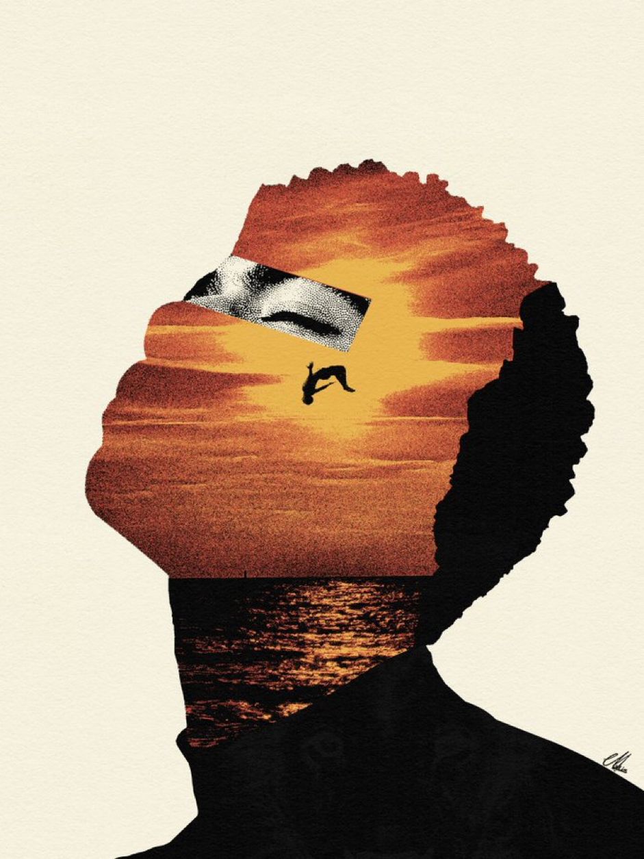







Your work,
front and centre.
A hero that leads with the images instead of describing them. Swap in your own and the corridor rebuilds around them.
Perspective Image Stream Hero
Let two image rails flow through a perspective corridor, using the work itself to capture visitors' attention.
A centered headline and supporting copy float above mirrored image rails, with configurable imagery, card density, speed, axis, and perspective path, freezing as a complete still under reduced-motion preferences.
Integrate the “Perspective Image Stream Hero” component into the current project.

[CORE GOALS]
1. Layout structure, responsive behavior, interaction states, and motion path/timing are the component's primary design assets; they take priority over reference copy and media.
2. Brand, copy, images, video, data, and links are replaceable content. Do not redesign the layout or substitute a merely similar animation when replacing them.
3. Complete material intake before coding. If source or a demo follows this prompt, treat it as the source of truth for layout and motion.

[COMPONENT SPECIFICATION]
Component type: Heroes
Goal: Let two image rails flow through a perspective corridor, using the work itself to capture visitors' attention.
Layout: Use a relative, overflow-hidden root with container-type: inline-size and express every corridor dimension in cqw rather than viewport-specific fixed pixels. The decorative image rails fill the container absolutely, with a default perspective origin of 50% horizontally and 55% vertically; the left and right rails use the same image sequence and mirror one another. Each card defaults to 18cqw by 25cqw with a 0.4cqw radius and object-cover imagery. Render copy in a higher-z-index foreground layer: center the headline near the top and the supporting paragraph near the bottom, using 6cqw vertical padding; set the headline with clamp(1rem, 5cqw, 3rem) and cap the supporting copy at 42cqw. Keep the light neutral background, dark headline, and secondary gray description. Do not add navigation, actions, metric cards, or background video that are absent from the current preview.
Interaction and motion: Create two mirrored rails in a 3D perspective corridor. Defaults are perspective=30, cardWidth=18, cardHeight=25, cardRadius=0.4, birthHeight=2.6, exitHeight=46, railBirth=-11, railExit=44, fan=3.3, turnBirth=6, turnExit=28, and stops=24, with cards=9, speed=18 seconds, and axis=55. Calculate scale as a geometric progression in apparent height, then derive z; use the fan curve to open each rail quickly in the distance and interpolate Y rotation from turnBirth to turnExit. Sample the path at stops points to generate separate left and right CSS keyframes dynamically. Render cards images on each rail, cycling a shorter image list, and use a negative delay of -(i × speed) / cards seconds so the first frame is already populated. The animation is linear and infinite and must not be driven by JavaScript timers. Use React.useId to create collision-free class and keyframe names per instance. Mark the rails aria-hidden and pointer-events: none, and disable image dragging. Under prefers-reduced-motion: reduce, pause rather than remove the card animations so the negative-delay distribution freezes as a complete corridor still.
Visual direction: Gray is the current reference color family. Expose final brand colors through props or configuration while preserving contrast and hierarchy.
Technical baseline: React, TypeScript, and Tailwind CSS. The API includes images (src/alt array), cards=9, speed=18, axis=55, path, children, className, standard div props, and the cn utility dependency.

[PHASE 1: MATERIAL INTAKE — DO ONLY THIS NOW]
First inspect the current project and materials already supplied in this conversation. List only missing items required by this component. Do not install dependencies or create, delete, or modify files.

Material scope for this component:
1. Hero headline, intentional line break, and supporting copy anchored near the bottom
2. Exactly nine licensed images to match the default cards=9, with a consistent visual direction and preferably an approximately 18:25 portrait crop; repeat images only when fewer than nine are supplied
3. A local file or durable URL plus an internal description for each image; the preview rails are decorative and should not be redundantly announced by screen readers
4. Only when deviating from the default: desired card count, loop duration, axis height, or corridor path values

Output only this table. If items are missing, request them once by number; if nothing is missing, ask only for “Start integration” confirmation:
| # | Material or configuration | Required/optional | Quantity | Format, ratio, or copy-length guidance | Purpose | Fallback |

Rules:
- Do not request content already supplied or site-wide material the component will not display.
- Mark an item required only when its absence prevents correct rendering or operation; mark everything else optional.
- Distinguish brand/media/data/links from API and interaction configuration; do not describe an endpoint as an upload asset.
- Do not retain a reference brand or an unapproved third-party hotlink, and do not search for or invent customer assets.
- If required items are missing, ask the user to supply each one or approve a neutral placeholder for that item. Receiving only some materials must not unlock phase 2.
- If only optional items are missing, ask the user to mark each one “supply” or “skip.” If nothing is missing, state “Materials complete” inside the table.
- Enter phase 2 only after every required item is marked “supplied/placeholder approved,” every optional item is marked “supplied/skipped,” and the user explicitly replies “Start integration.”
- The user may instead reply “Continue with neutral placeholders.” This approves neutral placeholders for every missing item and starts integration immediately. Clearly mark every placeholder.
- Stop after the intake table and one confirmation request. Wait for the user's reply; do not write or modify code yet.

[PHASE 2: INTEGRATE AFTER CONFIRMATION]
Begin only after all three gates above are satisfied, or the user explicitly replies “Continue with neutral placeholders.” If only partial materials arrive and the gates remain incomplete, update the same intake table and keep waiting; do not code.
1. Map supplied materials by checklist number into props or configuration; do not hard-code brand, copy, media, metrics, or links.
2. Preserve the layout hierarchy, key proportions, responsive breakpoints, interaction states, and motion timeline above. If an asset ratio or copy length differs, make only the smallest adjustment needed to preserve the design and report it.
3. Reuse existing components and dependencies where possible. Do not overwrite unrelated pages, routes, global styles, or configuration.
4. Output or write the complete component source, minimal demo, required imports, and dependency commands, following the project's existing directories.
5. Verify 360px, 768px, and 1440px layouts with no horizontal overflow, plus keyboard, touch, focus-visible, asset failure fallbacks, and reduced-motion behavior.
6. Run the project's existing type check, tests, and production build.

[COMPLETION REPORT]
Report only the changed files, used and outstanding material numbers, dependency changes, framework adaptation differences, verification commands and results, and unresolved blockers.